
Contemporary Problem SolvingA Comprehensive Introduction with Real-World Examples

Preface Accessibility Statement

This book meets WCAG 2.1 Level AA accessibility standards. All diagrams include descriptive text and SVG markup for screen readers. Color contrast meets WCAG requirements (text ≥4.5:1, graphics ≥3:1). Mathematical content uses proper semantic markup. If you encounter accessibility issues, please report them.

Chapter 1 Graph Theory

Section 1.1 What Is a Graph?

Graph theory is a branch of mathematics that studies relationships between objects. These relationships are represented using graphs, which consist of vertices connected by edges. Graphs are used to model real-world systems such as transportation networks, communication systems, social networks, and scheduling problems.

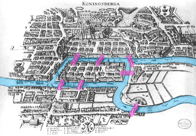
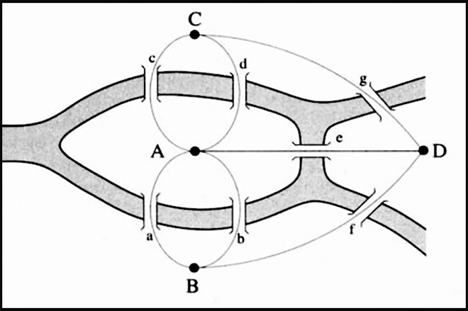
Definition 1.1.1. Vertex.

A vertex (also called a node) is a fundamental unit of a graph representing an object or entity. In this book, vertices will be labeled using letters.
In real-life applications, vertices can represent cities in a road network, people in a social network, or computers in a communication system.

Definition 1.1.2. Edge.

An edge is a connection between two vertices. An edge indicates that a relationship exists between the corresponding objects.
For example, an edge may represent a road between two cities, a friendship between two people, or a cable connecting two computers.

Definition 1.1.3. Degree of a Vertex.

The degree of a vertex is the number of edges incident to that vertex.
The degree of a vertex measures how connected that object is within the system. In a social network, a person with a high degree has many connections, while a person with degree zero is isolated.

Definition 1.1.4. Odd and Even Degree.

A vertex has even degree if its degree is an even number, and odd degree if its degree is an odd number.
Whether a vertex has odd or even degree is a surprisingly powerful idea. For instance, later we will prove that the existence of certain “walk-through-every-edge” routes depends only on which vertices have odd degree.

Subsection 1.1.1 An Example: Computing Degrees

Consider the graph G shown in Figure 1.1.5. The vertices are labeled with letters, emphasizing that labels are identifiers and not geometric locations.
Figure 1.1.5. Graph G (Drawing 1).
To compute degrees, count the number of edges touching each vertex:
  • deg(A)=2 (edges to B and F), so A has even degree.
  • deg(B)=3 (edges to A, C, and E), so B has odd degree.
  • deg(C)=2 (edges to B and D), so C has even degree.
  • deg(D)=2 (edges to C and E), so D has even degree.
  • deg(E)=3 (edges to D, F, and B), so E has odd degree.
  • deg(F)=2 (edges to E and A), so F has even degree.
In this example, the odd-degree vertices are B and E, and all other vertices have even degree. Noticing which vertices are odd will become important later.
Checkpoint 1.1.6.
Using Figure 1.1.5, list all vertices of odd degree and all vertices of even degree.
Answer.
Odd degree: B and E. Even degree: A, C, D, F.

Subsection 1.1.2 Very Small Graphs

It can be helpful to start with very small graphs when learning new ideas. Even a single edge already illustrates how vertices and edges work together, and a three-vertex path illustrates how degrees can differ from one vertex to another.
Figure 1.1.7. A tiny graph with two vertices and one edge.
In Figure 1.1.7, both vertices have degree 1, so both are odd.
Figure 1.1.8. A small graph with three vertices (a path).
In Figure 1.1.8, vertices A and C each have degree 1 (odd), while vertex B has degree 2 (even).
Checkpoint 1.1.9.

Subsection 1.1.3 Why the Placement of Vertices Does Not Matter

The visual placement of vertices in a drawing of a graph does not affect the graph itself. What matters is which vertices are connected to which other vertices. In other words, the graph is determined by a one-to-one correspondence between its vertex set and its set of connections (edges).
Two drawings represent the same graph if:
  • They use the same vertex labels (the same “named objects”).
  • They connect exactly the same pairs of vertices with edges.
The graph G is drawn again in Figure 1.1.10. The vertices have been moved, but the edges connect the same pairs of letters. Therefore these are two drawings of the same graph.
Figure 1.1.10. Graph G (Drawing 2). Same vertices, same edges—different placement.
Checkpoint 1.1.11.
Compare Figure 1.1.5 and Figure 1.1.10. Choose one vertex (for example B) and list all vertices adjacent to it in both drawings. What do you observe?
Answer.
Vertex B is adjacent to A, C, and E in both drawings. The adjacency relationships do not change, so the placement of vertices does not change the graph.
This flexibility is useful: we often redraw graphs to make patterns easier to see, to prevent clutter, or to highlight a particular feature.

Subsection 1.1.4 A Real-Life Example of a Graph

Consider a small network of airline routes. Each vertex represents an airport, and an edge represents a direct flight between two airports. (We label the airports using letters, but in real data they might be airport codes.)
Figure 1.1.12. A route network. Vertex B functions like a hub because it is connected to many other vertices.
The degree of an airport corresponds to the number of direct flights available from that location. Airports with high degree are influential: if one of them closes due to weather, many routes are affected. Graph models help planners study robustness, rerouting, and efficient expansion of the network.
Checkpoint 1.1.13.
In Figure 1.1.12, compute the degree of each vertex and identify which vertices have odd degree.
Answer.
deg(A)=2, deg(B)=4, deg(C)=2, deg(D)=2, deg(E)=2. All vertices have even degree, so there are no odd-degree vertices.

Subsection 1.1.5 Example: A Schematic Rail Network Across the European Union

Real transportation systems are often modeled using graphs. In this example, we model a simplified rail system connecting several European Union capital cities. Each vertex represents a capital city, and each edge represents a major rail connection or corridor. The diagram is schematic: the placement of vertices reflects general geography and clarity, not exact distances.
Figure 1.1.14. A schematic rail network using EU capital cities as vertices. Only the connections (edges) matter; the drawing is not a geographic map.
The vertices in Figure 1.1.14 are labeled with letters to keep the picture readable. The table below gives the one-to-one correspondence between each letter and its capital city.
Table 1.1.15. Key for the vertices in Figure 1.1.14.
Vertex Capital city
A Dublin
B Lisbon
C Madrid
D Paris
E Brussels
F Amsterdam
G Berlin
H Copenhagen
I Stockholm
J Warsaw
K Prague
L Vienna
M Budapest
N Rome
O Athens
Checkpoint 1.1.16.
Using Figure 1.1.14, compute the degree of each vertex. Which vertices have odd degree?
Answer.
One possible set of degrees from the diagram: deg(A)=1, deg(B)=1, deg(C)=2, deg(D)=4, deg(E)=3, deg(F)=2, deg(G)=7, deg(H)=2, deg(I)=1, deg(J)=3, deg(K)=3, deg(L)=3, deg(M)=5, deg(N)=3, deg(O)=3. The odd-degree vertices are A, B, E, G, I, J, K, L, M, N, O.

Subsection 1.1.6 A one-to-one correspondence of vertices

Two graphs are the same if there is a one-to-one correspondence between their vertex sets that preserves structure: whenever two vertices are connected by an edge in the first graph, their images are connected by an edge in the second graph. The correspondence below shows that the two graphs in Figure 1.1.17 have the same structure, even though their vertex labels are different.
Figure 1.1.17. Two similar graphs with different vertex labels.
We can look at a mapping from one graph to the next by the following table. This mapping is considered a one-to-one correspondence. You can check that every edge in the top graph is carried to an edge in bottom graph. For example, since \(DG\) is unique, the degree of \(G\) is one, in the top, its image \(QS\) is also the unique edge in the bottom.
Table 1.1.18. A one-to-one correspondence between vertices that preserves structure.
Vertex in \(G\) Image in \(H\)
\(A\) \(T\)
\(B\) \(P\)
\(C\) \(V\)
\(D\) \(Q\)
\(E\) \(U\)
\(F\) \(R\)
\(G\) \(S\)

Section 1.2 Graph Terminology and Properties

Subsection 1.2.1 Simple Graphs

Definition 1.2.1. Simple Graph.
A simple graph is an (undirected) graph that has no loops (no edge that begins and ends at the same vertex) and no multiple edges (no more than one edge connecting the same pair of vertices).
Real-life connection: Simple graphs are useful when the only thing that matters is whether two objects are connected, not how many connections there are or whether something connects to itself. For example, a “friendship network” is often modeled as a simple graph: two people are either friends or not, and we usually do not draw multiple friendship edges between the same pair of people.
The next two examples use the same set of vertices and nearly the same connections. The difference is that the second graph contains features that violate the definition of a simple graph.
Example 1.2.2. A graph that is simple.
The graph in Figure 1.2.3 is simple: it has no loops and no multiple edges. Each pair of vertices is connected by at most one edge.
Figure 1.2.3. A simple graph.
Example 1.2.4. A similar graph that is not simple.
The graph in Figure 1.2.5 uses the same vertex labels as Figure 1.2.3, but it is not simple. It contains a loop at vertex C and it contains multiple edges between vertices A and B.
Figure 1.2.5. A non-simple graph (it contains a loop and multiple edges).
Checkpoint 1.2.6.
Explain why the graph in Figure 1.2.5 is not a simple graph. Then describe one change you could make to turn it into a simple graph.
Answer.
It is not simple because it has a loop at C and it has two distinct edges between A and B. Removing the loop at C and deleting one of the two A–B edges would make the graph simple.

Subsection 1.2.2 More Practice: Simple Graphs

Checkpoint 1.2.7.
Consider a graph with vertices A, B, C, and D. The edges are AB, BC, CD, DA, and AC. There are no loops and no repeated edges. Is this graph a simple graph? Explain your reasoning.
Answer.
Yes, the graph is simple. It has no loops and no multiple edges. Although vertex A is connected to both B and C, each pair of vertices is connected by at most one edge.
Checkpoint 1.2.8.
A graph has vertices A, B, and C. There is an edge from A to B, an edge from B to C, and two distinct edges connecting A and C. Is this graph simple? Why or why not?
Answer.
No, the graph is not simple. While it has no loops, it contains multiple edges between the same pair of vertices, A and C. A simple graph may have at most one edge between any two vertices.

Subsection 1.2.3 Diagnostic Practice: Simple or Not?

Checkpoint 1.2.9.
A graph has vertices A, B, C, D, and E. Vertex A is connected to every other vertex. There are no loops, and no pair of vertices is connected by more than one edge. Some students claim the graph is not simple because vertex A has a high degree. Are they correct? Explain.
Answer.
The students are incorrect. A high degree does not violate the definition of a simple graph. Since the graph has no loops and no multiple edges, it is a simple graph, regardless of how large the degree of a vertex is.
Checkpoint 1.2.10.
For each of the following descriptions, determine whether the graph is simple, not simple, or whether there is not enough information to decide.
  1. A graph has vertices A, B, and C. There is an edge from A to B and an edge from B to C.
  2. A graph has vertices A and B, and exactly two distinct edges connect A and B.
  3. A graph has vertices A, B, and C. There is an edge from A to A and an edge from A to B.
Answer.
  1. There is not enough information to decide. The description does not say whether there are additional edges or loops.
  2. The graph is not simple because it contains multiple edges between the same pair of vertices.
  3. The graph is not simple because it contains a loop at vertex A.

Subsection 1.2.4 A Graph That Is Not Simple

The graph in Figure 1.2.11 has ten vertices labeled A through J. From any vertex, it is possible to travel along edges to reach any other vertex. However, the graph is not simple: there is exactly one pair of vertices joined by more than one edge.
Figure 1.2.11. A graph with ten vertices that is not simple (it has one pair of multiple edges).
Checkpoint 1.2.12.
Checkpoint. Using Figure 1.2.11:
  1. Identify the pair of vertices that are joined by more than one edge.
  2. Explain why this graph is not a simple graph.
  3. Describe one change that would make the graph a simple graph while keeping all ten vertices.
Answer.
  1. The pair is D and E.
  2. The graph is not simple because D and E are connected by two distinct edges (multiple edges). A simple graph can have at most one edge between any two vertices.
  3. Delete one of the two edges between D and E. The resulting graph keeps all ten vertices and has no multiple edges, so it becomes simple.

Section 1.3 Paths, Circuits, Subgraphs, and Connectivity

Subsection 1.3.1 Path

Definition 1.3.1.
Path
A path in a graph is a sequence of distinct edges \(e_1, e_2, \dots, e_k\) such that consecutive edges share exactly one common vertex. The first and last edges each share a vertex with only one other edge in the sequence.
Real-life connection: Paths model routes in transportation networks, data moving through communication systems, or sequences of actions in workflows.
In a simple graph, one can just list the vertices that connect the edges of the path without ambiguity.
Figure 1.3.2.
Checkpoint 1.3.3. Concept Check.
Checkpoint 1.3.4. Concept Check.
Can a path repeat an edge? Briefly explain.
Solution.
No. Repeating an edge would violate the definition of a path as a sequence of adjacent vertices without reuse of edges.

Subsection 1.3.2 Length of a Path

Definition 1.3.5.
Length of a path
The length of a path is the number of edges it contains.
Real-life connection: Length corresponds to the number of steps, hops, or transfers required to move from one point to another.
Figure 1.3.6.
Checkpoint 1.3.7. Concept Check.
What is the length of the path \(A,B,C,E\text{?}\)
Solution.
The length is \(3\text{,}\) since the path uses three edges.
Checkpoint 1.3.8. Concept Check.
Does the length of a path depend on how far apart the vertices appear in a drawing?
Solution.
No. Length depends only on the number of edges, not on geometric distance.

Subsection 1.3.3 Circuit

Definition 1.3.9.
Circuit
A circuit is a path that starts and ends at the same vertex.
Real-life connection: Circuits model round trips, closed delivery routes, and feedback loops in systems.
Figure 1.3.10.
Checkpoint 1.3.11. Concept Check.
Is \(A,B,C,D,E,A\) a circuit?
Solution.
Yes. It begins and ends at the same vertex and follows edges throughout.
Checkpoint 1.3.12. Concept Check.
Is \(A,B,C,D,A\) a circuit?
Solution.
No, because there is no edge connecting \(A\) and \(D\)

Subsection 1.3.4 Subgraph

Definition 1.3.13.
Subgraph
A graph \(H\) is a subgraph of a graph \(G\) if all vertices and edges of \(H\) also belong to \(G\text{.}\)
Real-life connection: Subgraphs represent focusing on smaller parts of a large network, such as a local neighborhood in a city map.
Figure 1.3.14.
Checkpoint 1.3.15. Concept Check.
If a graph has vertices \(\{A,B,C,D\}\text{,}\) can a subgraph have vertices \(\{A,C\}\text{?}\)
Solution.
Yes. A subgraph may contain any subset of the original vertices.
Checkpoint 1.3.16. Concept Check.
Must a subgraph include all edges between its chosen vertices?
Solution.
No. A subgraph may omit edges even if both endpoints are included.

Subsection 1.3.5 Component

Definition 1.3.17.
Component
A component of a graph is a maximal connected subgraph.
Real-life connection: Components model disconnected systems, such as separated communication networks after a failure.
Figure 1.3.18.
Checkpoint 1.3.19. Concept Check.

Subsection 1.3.6 Disjoint

Definition 1.3.20.
Disjoint
Two subgraphs are disjoint if they share no vertices.
Real-life connection: Disjoint subgraphs represent independent groups with no shared members or resources.
Figure 1.3.21.
Checkpoint 1.3.22. Concept Check.
Checkpoint 1.3.23. Concept Check.
Are subgraphs with vertex sets \(\{A,B\}\) and \(\{C,D\}\) disjoint?
Solution.
Yes. They share no vertices.
Checkpoint 1.3.24. Concept Check.
If two subgraphs share an edge, can they be disjoint?
Solution.
No. Sharing an edge implies sharing vertices.

Subsection 1.3.7 Connected

Definition 1.3.25.
Connected
A graph is called connected if for every pair of distinct vertices \(u\) and \(v\text{,}\) there exists a path whose first edge is starts at \(u\) and whose last edge is ends at \(v\text{.}\)
In a connected graph, starting at any vertex, it is possible to move along edges and eventually reach every other vertex in the graph.
A graph may fail to be connected even if most of its vertices are joined together. If there exists at least one pair of vertices with no path between them, the graph is not connected.
Real-life connection: In a transportation or communication network, a graph is connected if it is possible to travel from any location to any other location using the available routes. If the network is not connected, then some locations are completely unreachable from others, no matter how many intermediate stops are allowed.
Real-life connection 2: Consider a set of cities connected by roads. The road network is connected if you can drive from any city to any other city without leaving the road system. If even one city cannot be reached from another, the network is not connected.
Checkpoint 1.3.26. Concept Check.
Can a graph be connected if it contains a vertex of degree zero?
Solution.
No. A vertex of degree zero has no incident edges, so there is no path connecting it to any other vertex.
Checkpoint 1.3.27. Concept Check.
Can a connected graph have more than one component?
Solution.
No. A connected graph has exactly one component.

Subsection 1.3.8 Bridge

Definition 1.3.28.
Bridge
An edge is a bridge if removing it increases the number of components of the graph.
Real-life connection: Bridges model single points of failure in networks, where losing one connection disconnects the system.
Figure 1.3.29.
Checkpoint 1.3.30. Concept Check.
Checkpoint 1.3.31. Concept Check.
Checkpoint 1.3.32. Concept Check.
Checkpoint 1.3.33. Concept Check.
Can an edge that lies on a circuit be a bridge?
Solution.
No. Removing such an edge does not disconnect the graph.

Section 1.4 Euler Circuits

Subsection 1.4.1 Introduction

In the early eighteenth century, the city of Königsberg was divided by the Pregel River into several land regions connected by seven bridges. A popular question arose among the citizens: was it possible to take a walk that crossed each bridge exactly once and returned to the starting point?
Figure 1.4.1.
A map of Königsberg showing the seven bridges connecting the land regions. The problem asks whether each bridge can be crossed exactly once in a single walk.
Many attempted to find such a walk, but none succeeded. The difficulty did not lie in the distances between regions or the physical layout of the city. Instead, the problem depended only on how the bridges connected the land masses.
In 1736, the Swiss mathematician Leonhard Euler provided a definitive answer. Euler realized that the problem could be simplified by ignoring geography entirely. Each land region could be represented as a point, and each bridge as a connection between points.
Figure 1.4.2.
Leonhard Euler (1707–1783), whose analysis of the Königsberg bridges problem is widely regarded as the beginning of graph theory.
Figure 1.4.3.
Euler created a similar representation of the seven bridges. He assigned the different parts of the city as Vertices and the bridges as Edges.
Checkpoint 1.4.4. Try yourself.
Using Euler’s representation of Figure 1.4.3 koenigsberg, can you solve the problem of creating a circuit across each edge once and only once? List the Verices \(A,B,C,D\) in the order that you visited them in starting at A.
Solution.
This is why Euler is so famous, he was able to take this problem and mathematically prove it is not possible .
Euler observed that whenever a person enters a region by crossing a bridge, it must also leave that region by crossing another bridge. As a result, the bridges connecting to each region naturally pair up. If a region has an odd number of bridges then a circuit is impossible.
In the Königsberg problem, every land region had an odd number of bridges. Euler concluded that the desired circuit could not exist. His reasoning introduced a new way of thinking about networks, focusing on structure rather than shape or distance.
This work laid the foundation for graph theory and leads directly to the study of Euler circuits, which are circuits that use every edge of a graph exactly once. In the sections that follow, we will study when such walks exist and how to find them efficiently.

Subsection 1.4.2 Euler Paths and Euler Circuits

Definition 1.4.5. Euler Path.
An Euler path is a path in a graph that uses every edge exactly once. The path may start and end at different vertices, and vertices may be visited more than once, but no edge is repeated.
Definition 1.4.6. Euler Circuit.
An Euler circuit is an Euler path that starts and ends at the same vertex. Equivalently, it is a closed walk that uses every edge exactly once.
Every Euler circuit is an Euler path, but not every Euler path is an Euler circuit.
Example 1.4.7. A graph with an Euler circuit.
The following five-vertex graph has an Euler circuit: it is possible to traverse every edge exactly once and return to the starting vertex.
Figure 1.4.8. Five vertices with an Euler circuit.
Example 1.4.9. A graph with an Euler path but no Euler circuit.
The following five-vertex graph has an Euler path, but it has no Euler circuit. A traversal using every edge exactly once must start and end at different vertices.
Figure 1.4.10. Five vertices with an Euler path but no Euler circuit.
Example 1.4.11. Another graph with an Euler path but no Euler circuit.
The following five-vertex graph has an Euler path, but it has no Euler circuit. A traversal using every edge exactly once must start and end at different vertices.
Figure 1.4.12. Five vertices with an Euler path but no Euler circuit.
Example 1.4.13. Counterexample: checking degrees is not enough.
A common mistake is to check only vertex degrees and forget the graph must be connected (for the edges you want to traverse). In the graph below, every vertex has even degree, but the graph has two separate parts, so there is no single closed walk that can use all edges exactly once.
Figure 1.4.14. All degrees are even, but the graph is disconnected, so no Euler circuit uses every edge.
Checkpoint 1.4.15. Concept Check.
  1. In your own words, explain why repeating a vertex does not automatically disqualify a walk from being an Euler path.
  2. What extra condition (besides “every degree is even”) is needed to guarantee an Euler circuit can use every edge exactly once?

Subsection 1.4.3 Euler’s Theorem

This theorem gives a complete characterization of when it is possible to traverse every edge of a graph exactly once. The result depends only on the degrees of the vertices and not on the specific layout or drawing of the graph.
If every vertex has even degree, it is possible to enter and leave each vertex using distinct edges and return to the starting point. If exactly two vertices have odd degree, the traversal must start at one of these vertices and end at the other.
If more than two vertices have odd degree, or if the graph is not connected, then no Euler path or Euler circuit exists.
Checkpoint 1.4.17.
A connected graph has seven vertices. Five vertices have degree 2 and two vertices have degree 3.
  1. Does this graph have an Euler circuit?
  2. Does this graph have an Euler path?
Solution.
There is no Euler circuit because not all degrees are even. There is an Euler path because there are exactly two vertices of odd degree.

Subsection 1.4.4 Concept Check: Euler Paths, Euler Circuits, and Connectivity

Each figure below shows a graph with at least four vertices and at least seven edges. Use the definitions of Euler path and Euler circuit, along with the ideas of a bridge and disjoint graphs, to match each graph with the correct description.
Figure 1.4.18.
Figure 1.4.19.
Figure 1.4.20.
Figure 1.4.21.
Checkpoint 1.4.22.
Match each graph (1--4) with the correct description below. Each description is used exactly once.
  • The graph is disjoint.
  • The graph has an Euler path but does not have an Euler circuit.
  • The graph has an Euler circuit.
  • The graph has a bridge.
Solution.
Graph 1 has an Euler circuit. Graph 2 has an Euler path but no Euler circuit. Graph 3 has a bridge (the edge incident to the degree-1 vertex). Graph 4 is disjoint.

Subsection 1.4.5 Exercise: Identifying Euler Paths and Circuits

Figure 1.4.23.
Figure 1.4.24.
Figure 1.4.25.
Figure 1.4.26.
Checkpoint 1.4.27.
For each figure above, determine whether the graph has an Euler circuit, an Euler path but no Euler circuit, or neither.
Solution.
Figure 1 has an Euler circuit. Figure 2 has an Euler path but no Euler circuit. Figure 3 has neither. Figure 4 is disjoint and has neither an Euler path nor an Euler circuit.

Section 1.5 Eulerization

Recall: a connected graph has an Euler circuit if and only if every vertex has even degree. When a graph fails this condition, we often still want a single closed route that covers every edge. The idea of eulerization is to “fix” the graph so that such a route becomes possible. A connected graph has an Euler circuit if and only if every vertex has even degree. When a graph does not satisfy this condition, we may modify it in one of two ways.

Subsection 1.5.1 Why Eulerize?

Eulerization shows up whenever a worker or vehicle must traverse an entire network of streets, hallways, pipes, or cables, and it is acceptable to repeat some streets or corridors. The goal is typically to finish where you started while covering every required segment at least once.
Common examples include postal delivery routes, street sweeping, snow plowing, garbage collection, campus or hospital security patrols, meter reading, utility inspection (gas/water/electric), and warehouse robots that must traverse every aisle segment.

Subsection 1.5.2 Adding Edges vs. Reusing Edges

There are two closely related ways to think about eulerization.
Adding edges means we actually modify the graph by inserting new edges between existing vertices. Each new edge increases the degree of its two endpoints by one. In an abstract math setting, this is a direct way to make all degrees even.
Reusing edges means the physical network does not change, but our route is allowed to traverse some existing edges more than once. In effect, any edge that we traverse twice is behaving like an additional copy of that edge. This viewpoint is usually the correct one for real life: you cannot “build a new street,” but you can drive a street again.
These two viewpoints produce the same mathematics: “reusing an edge” is equivalent to “adding a duplicate edge” in a multigraph. The important difference is interpretation: one changes the network; the other changes only the route.

Subsection 1.5.3 The Core Idea

Vertices of odd degree are the obstacle to an Euler circuit. Eulerization works by pairing odd-degree vertices and ensuring each paired set has an additional walk between them. This makes all degrees even, and then an Euler circuit exists.

Subsection 1.5.4 Easy Example

Figure 1.5.1. A simple connected graph.
Checkpoint 1.5.2.
Determine the vertices of odd degree.
Add one edge to make the graph Eulerian.
Solution.
Vertices C and D have odd degree. Adding the edge C–D makes all degrees even, producing an Euler circuit.
Checkpoint 1.5.3.
Determine the vertices of odd degree.
Reuse edges to make the graph Eulerian.
Solution.
Figure 1.5.4. A simple connected graph.
By adding the edges as shown in the graph, all vertices now are even degree. Thus we can say this graph is Eulerian

Subsection 1.5.5 Example

Figure 1.5.5. A simple connected graph.
Checkpoint 1.5.6.
Determine the vertices of odd degree.
Add one edge to make the graph Eulerian.
Solution.
Vertices G and B have odd degree. Adding the edge B–G makes all degrees even, producing an Euler circuit.
Checkpoint 1.5.7.
Determine the vertices of odd degree.
Reuse edges to make the graph Eulerian.
Solution.
Figure 1.5.8. A simple connected graph.
By adding BD and DG it now makes every vertex have even degree. Thus making the graph Eulerian.

Section 1.6 Constructing an Euler Circuit or Euler Path

Knowing that an Euler circuit or Euler path exists is only part of the problem. We also want a systematic way to find one. Fleury’s Algorithm provides a constructive method: at each step, choose an edge to traverse, but avoid taking a bridge too early.

Definition 1.6.1. Fleury’s Algorithm.

Let G be a connected graph.
If G has an Euler circuit, choose any starting vertex. If G has an Euler path but not an Euler circuit, start at one of the vertices of odd degree.
Repeat until no edges remain:
  1. From your current vertex, choose an incident edge to traverse.
  2. Do not choose a bridge unless it is the only remaining incident edge.
  3. Traverse the chosen edge and delete it from the graph.
The sequence of vertices you visit is an Euler circuit or Euler path (as appropriate).

Subsection 1.6.1 Why Avoid Bridges?

A bridge is an edge whose removal disconnects the graph. If you cross a bridge too early, you may separate unused edges into a part of the graph that you can no longer reach, causing the traversal to get stuck.
Fleury’s rule “avoid bridges unless forced” is a safeguard: it tries to keep as many unused edges reachable as possible.

Subsection 1.6.2 Worked Examples

Subsubsection 1.6.2.1 Example 1: An Euler Circuit
Figure 1.6.2. A connected graph in which every vertex has even degree.
Since every vertex has even degree, an Euler circuit exists. Start at A. At each step, you may choose among several edges, but you should avoid choosing a bridge if one occurs. Continuing until all edges are used produces an Euler circuit.
One valid Euler circuit for this graph is: A–B–C–D–E–B–D–A–C–E–A.
Figure 1.6.3. Step 0: Starting Position
Figure 1.6.4. Step 1: first step
Figure 1.6.5. Step 2-6: remaining steps
Subsubsection 1.6.2.2 Example 2: An Euler Path (No Bridges)
Figure 1.6.6. A connected graph with exactly two odd-degree vertices (A and C).
This graph has exactly two vertices of odd degree (A and C), so an Euler path exists. Start at A (or at C). In this graph, no edge is a bridge at the beginning, so Fleury’s rule does not restrict your first choices.
One valid Euler path starting at A is: A–B–C–D–A–C.
Subsubsection 1.6.2.3 Example 3: A Bridge Becomes Necessary
Figure 1.6.7. A connected graph where the edge D–E is a bridge.
The vertices of odd degree are D and E, so an Euler path exists and must start at D or E. Start at D. The edge D–E is a bridge, so Fleury’s Algorithm tells you to avoid it as long as there is another unused edge incident to D. Therefore, you should traverse the cycle first, and only take D–E at the end.
One valid Euler path starting at D is: D–A–B–C–D–E.

Subsection 1.6.3 Concept Check: Identifying Bridges

Figure 1.6.8. A graph for bridge identification.
Checkpoint 1.6.9.
In Figure 1.6.8, which edge(s) are bridges? Explain briefly.
Solution.
The edge C–D is a bridge. Removing C–D disconnects the graph into two components: the triangle on {A,B,C} and the triangle on {D,E,F}.
Checkpoint 1.6.10.
Apply Fleury’s Algorithm to Figure 1.6.7 and list the edges in the order you traverse them, starting at D.
Solution.
One valid order is: D–E, E–F, F–D, D–C, C–A, A-B, B-C. (Equivalently, the Euler path is D-E-F-D-C-A-B-E.)

Subsection 1.6.4 Notes

Fleury’s Algorithm is easy to understand, but it can be slow for large graphs because checking whether an edge is a bridge may require repeated connectivity checks.

Section 1.7 Hamiltonian Paths and Hamiltonian Circuits

In the previous sections, we studied Euler circuits—paths that traverse every edge of a graph exactly once. Now we turn our attention to a different type of circuit: one that visits every vertex exactly once. This distinction leads to fundamentally different problems and applications.

Definition 1.7.1. Hamiltonian Path.

A Hamiltonian path is a path that passes through all the vertices of a graph exactly once. The path may use only some of the edges, and vertices may be visited in any order, but each vertex appears exactly once.

Definition 1.7.2. Hamiltonian Circuit.

A Hamiltonian circuit is a Hamiltonian path that starts and ends at the same vertex. If a graph has a Hamiltonian circuit, we say the graph is Hamiltonian.
Real-life connection: Hamiltonian circuits model tour routes where a visitor must see all locations exactly once and return home, or a salesperson visiting all clients exactly once before returning to the office. Unlike Euler circuits (which cover every street), Hamiltonian circuits focus on visiting every location.

Remark 1.7.3. Euler vs. Hamiltonian: A Key Difference.

An Euler circuit uses every edge exactly once (but may visit vertices multiple times). A Hamiltonian circuit visits every vertex exactly once (but may skip edges). These are completely different constraints with different methods for finding solutions.

Subsection 1.7.1 Complete Graphs

Definition 1.7.4. Complete Graph.
A complete graph is a simple graph in which every pair of distinct vertices is connected by exactly one edge. A complete graph with \(n\) vertices is denoted \(\K{n}\text{.}\)
In a complete graph, there are no missing connections. Each vertex is directly connected to every other vertex. This property makes complete graphs useful for modeling situations where every participant must interact with every other participant.
Example 1.7.5. Tournament Round-Robin Scheduling.
A chess tournament organizes a round-robin competition where every player must play every other player exactly once. With five players, we model this as \(\K{5}\text{:}\) each vertex represents a player, and each edge represents a scheduled match.
\(\K{5}\) has \(\frac{5 \cdot 4}{2} = 10\) edges, meaning exactly 10 matches must be played. Each of the five players plays against four opponents (degree 4 for each vertex).
More generally, in a round-robin tournament with \(n\) players, the number of matches is \(\frac{n(n-1)}{2}\text{,}\) the number of edges in \(\K{n}\text{.}\)
Checkpoint 1.7.6.
How many matches are required for a round-robin tournament with 8 teams? What is the degree of each team in the corresponding complete graph?
Answer.
A tournament with 8 teams is modeled by \(\K{8}\text{.}\) The number of matches is \(\frac{8 \cdot 7}{2} = 28\text{.}\) Each team plays every other team, so each vertex has degree 7.

Subsection 1.7.2 Small Examples: Building Intuition

Let’s start with a very small graph to understand Hamiltonian circuits.
Figure 1.7.7. A complete graph with three vertices (a triangle).
In Figure 1.7.7, the graph \(\K{3}\) has vertices A, B, C with all possible edges. A Hamiltonian circuit must visit all three vertices exactly once and return to start. One such circuit is \(A–B–C–A\text{.}\) Another is \(A–C–B–A\text{.}\)
Checkpoint 1.7.8. Concept Check.
In Figure 1.7.7, is \(A–B–A–C–A\) a Hamiltonian circuit? Briefly explain why or why not.
Solution.
No. A Hamiltonian circuit must visit each vertex exactly once. This path visits A three times, so it is not Hamiltonian.
Figure 1.7.9. A complete graph with four vertices.
In Figure 1.7.9, the graph \(\K{4}\) has four vertices, and we need to visit each exactly once. One Hamiltonian circuit is \(A–B–C–D–A\text{.}\) Another is \(A–B–D–C–A\text{.}\)
Checkpoint 1.7.10. Concept Check.
In Figure 1.7.9, how many different ways can you arrange the vertices B, C, D to form a Hamiltonian circuit starting and ending at A?
Solution.
You can arrange B, C, D in \(3! = 6\) different orders. However, if we consider \(A–B–C–D–A\) and \(A–D–C–B–A\) as the same circuit (one is the reverse of the other), then there are \(\frac{3!}{2} = 3\) distinct Hamiltonian circuits. These are:
Figure 1.7.11. Our first route.
Figure 1.7.12. Our second route.
Figure 1.7.13. Our third and final route.

Subsection 1.7.3 Counting Hamiltonian Circuits in Complete Graphs

In a complete graph \(\K{n}\text{,}\) we can analyze how many Hamiltonian circuits exist. If we fix a starting vertex (say, vertex A), then we must arrange the remaining \(n-1\) vertices in order. The number of ways to arrange \(n-1\) vertices is \((n-1)!\text{.}\)
However, two circuits that are reverses of each other visit the same vertices in the same geometric path—just in opposite directions. Many applications treat these as equivalent. Therefore, the number of distinct Hamiltonian circuits in \(\K{n}\) is often reported as \(\frac{(n-1)!}{2}\text{.}\)
Example 1.7.14. Counting Hamiltonian Circuits in \(\K{5}\).
How many Hamiltonian circuits does \(\K{5}\) have?
Solution.
Fixing vertex A as the start, we arrange the remaining four vertices B, C, D, E. There are \(4! = 24\) arrangements. Considering reverse directions as identical, the number of distinct circuits is \(\frac{4!}{2} = \frac{24}{2} = 12\text{.}\)
Checkpoint 1.7.15. Counting in Complete Graphs.
In general, how many distinct Hamiltonian circuits does \(\K{n}\) have (treating reverse circuits as identical)? What is the answer for \(\K{6}\text{?}\)
Solution.
The answer is \(\frac{(n-1)!}{2}\text{.}\) For \(\K{6}\text{,}\) this is \(\frac{5!}{2} = \frac{120}{2} = 60\) distinct circuits.

Subsection 1.7.4 Not Every Graph Is Hamiltonian

Complete graphs always have Hamiltonian circuits, but many other graphs do not. A graph might have edges missing, or be sparse, making it impossible to visit all vertices exactly once.
Figure 1.7.16. A sparse graph that is not Hamiltonian.
In Figure 1.7.16, vertex D has degree 1 (connected only to E). Any path visiting D must enter via E and leave via E, which means E is visited twice—violating the Hamiltonian condition. Therefore, this graph has no Hamiltonian circuit.
Checkpoint 1.7.17. Concept Check.
In a Hamiltonian circuit, if a vertex has degree 1, can it be visited in the circuit? Explain.
Solution.
No. A degree-1 vertex has only one incident edge. In a Hamiltonian circuit, you must enter and leave each vertex using different edges. A degree-1 vertex makes this impossible.

Section 1.8 Complete Graphs and Hamiltonian Circuits

Complete graphs are always Hamiltonian—we can always visit all vertices exactly once and return home. This makes them important test cases for problems like the Traveling Salesman Problem.
This theorem is straightforward: in \(\K{n}\text{,}\) every pair of vertices is connected, so we can traverse vertices in any order and always find an edge to the next vertex.

Checkpoint 1.8.2. Checkpoint: Hamiltonian vs. Euler.

For each statement, decide whether it is true or false and briefly explain.
  1. If a graph has an Euler circuit, it must have a Hamiltonian circuit.
  2. If a graph has a Hamiltonian circuit, it must have an Euler circuit.
  3. Every complete graph has both an Euler circuit and a Hamiltonian circuit (for \(n \geq 4\)).
Answer.
  1. False. Euler requires using all edges; Hamiltonian requires visiting all vertices. They are independent. Think of a pinch point vertex, or a vertex that is connected to a bridge
  2. False. This is false by looking at \(\K{4}\text{.}\) Obviously it has a Hamiltonian circuit but no Euler circuit since all the vertices have degree 3(odd)
  3. For \(n \geq 4\text{:}\) \(\K{n}\) is Hamiltonian (by our theorem). \(\K{n}\) is Eulerian when all degrees are even, which happens when \(n\) is odd and \(n \geq 3\text{.}\) So for \(n=4, 6, 8, \ldots\text{,}\) \(\K{n}\) is Hamiltonian but not Eulerian.

Section 1.9 The Traveling Salesman Problem

Suppose you are a salesperson who must visit every city in a region, starting and ending at your home office. You have the cost of travel between every pair of cities. Your goal: find the route that visits all cities exactly once (a Hamiltonian circuit) with the minimum total cost.
This is the Traveling Salesman Problem (TSP), one of the most famous optimization problems in computer science and mathematics. Despite its simple statement, TSP is extremely hard to solve efficiently for large numbers of cities.

Subsection 1.9.1 Weighted Graphs and the TSP

Definition 1.9.1. Weighted Graph.
A weighted graph is a graph in which each edge has an associated number called a weight. The weight of a path or circuit is the sum of the weights of all edges in that path.
In the TSP, weights represent costs: distance, time, or monetary expense between cities. A complete weighted graph models the problem: every pair of cities is connected (you can travel between them), and each edge has a cost.

Subsection 1.9.2 Kristen’s Sales Trip: A Concrete Example

Kristen lives in Kansas City and must visit Denver, Minneapolis, Chicago, and Nashville next week to make sales pitches. She found flight prices between each pair of cities. The following table lists the costs (in dollars) for each route.
Table 1.9.2. Flight costs between cities (Kristen’s problem).
From To Cost
Kansas City Denver $272
Kansas City Minneapolis $194
Kansas City Chicago $249
Kansas City Nashville $466
Denver Minneapolis $247
Denver Chicago $250
Denver Nashville $462
Minneapolis Chicago $137
Minneapolis Nashville $410
Chicago Nashville $345
Kristen’s TSP: find a Hamiltonian circuit starting and ending in Kansas City that minimizes total flight cost.
Checkpoint 1.9.3. Concept Check.
Using Table 1.9.2, compute the total cost of the route: Kansas City → Chicago → Minneapolis → Denver → Nashville → Kansas City.
Figure 1.9.4. Kristen’s flight route on a complete graph with 5 vertices.
Solution.
$249 + $137 + $247 + $462 + $466 = $1,561.
Figure 1.9.5. Kristen’s flight network as a weighted complete graph with 5 vertices.

Subsection 1.9.3 The Brute Force Algorithm

One approach to the TSP is to check every possible Hamiltonian circuit and pick the one with the lowest cost. This is guaranteed to find the optimal solution, but it becomes impractical as the number of cities grows.
For \(\K{n}\text{,}\) there are \(\frac{(n-1)!}{2}\) distinct Hamiltonian circuits to check. For Kristen’s problem with 5 cities, this is \(\frac{4!}{2} = 12\) circuits—manageable. But for 10 cities, it’s \(\frac{9!}{2} = 181,440\) circuits; for 20 cities, it’s over 60 quadrillion. Brute force becomes useless for real-world problems.
Checkpoint 1.9.7. Brute Force Circuit Count.
A traveling salesman must visit 7 cities. Using the brute force algorithm, how many Hamiltonian circuits would need to be evaluated?
Solution.
\(\frac{(7-1)!}{2} = \frac{6!}{2} = \frac{720}{2} = 360\) circuits. That obviously would be very time consuming
Figure 1.9.8. \(\K{7}\text{,}\) a weighted complete graph with 7 vertices.

Subsection 1.9.4 The Nearest Neighbor Algorithm

Since brute force is impractical, we need heuristic algorithms that quickly find a good (but not necessarily optimal) solution. The Nearest Neighbor Algorithm uses a greedy approach: at each step, always go to the closest unvisited city.
The appeal of NNA is speed: it decides greedily at each step without looking ahead. The drawback: it may get stuck with expensive edges later because earlier choices blocked better routes.
Example 1.9.10. Applying NNA to Kristen’s Problem.
Apply the Nearest Neighbor Algorithm to Kristen’s problem, starting in Kansas City.
Solution.
Start: Kansas City.
Step 1: From Kansas City, closest unvisited city is Minneapolis ($194). Go to Minneapolis.
Step 2: From Minneapolis, closest unvisited city is Chicago ($137). Go to Chicago.
Step 3: From Chicago, closest unvisited city is Denver ($250). Go to Denver.
Step 4: From Denver, only unvisited city is Nashville ($462). Go to Nashville.
Step 5: From Nashville, return to Kansas City ($466).
Route: Kansas City → Minneapolis → Chicago → Denver → Nashville → Kansas City.
Total cost: $194 + $137 + $250 + $462 + $466 = $1,509.
Figure 1.9.11. Kristen’s Nearest Neighbor solution as a weighted complete graph with 5 vertices.
Subsection 1.9.4.1 Expanding NNA: Trying different starting points
Since NNA’s result depends on where you start, a natural consequence to recieve different results from different starting points.
  • For each vertex in the graph, apply the Nearest Neighbor Algorithm starting from that vertex.
  • Compare all circuits found and select the one with the minimum total weight.
This approach often finds better solutions than a single NNA run, though it requires \(n\) times as much computation (still very fast compared to brute force).
Checkpoint 1.9.12. Question on different starting points for NNA.
For Kristen’s 5-city problem, how many times would the Nearest Neighbor Algorithm need to run if using the Repetitive NNA approach?
Solution.
5 times (once starting from each city).
Checkpoint 1.9.13. A different starting point using NNA.
What would Kristen’s solution be if she started at Minneapolis
Solution.
Route: M → C → K → D → N → M
Total: $137 + $249 + $272 + $462 + $410 = $1,530
Figure 1.9.14. Kristen’s Nearest Neighbor solution as a weighted complete graph with 5 vertices.

Section 1.10 Extended Example: A Larger TSP

Let’s consider a more challenging problem with 7 cities: Kansas City (K), Chicago (C), Minneapolis (M), Denver (D), Nashville (N), Omaha (O), and Dallas (A).
Table 1.10.1. Flight costs for 7 cities.
K C M D N O A
K 249 194 272 466 576 127
C 249 137 250 345 312 130
M 194 137 247 410 430 147
D 272 250 247 462 451 125
N 466 345 410 462 552 284
O 576 312 430 451 552 423
A 127 130 147 125 284 423

Checkpoint 1.10.2. Checkpoint: Solving a Larger TSP.

If you were to use the brute force algorithm, how many distinct Hamiltonian circuits would need to be evaluated?
Answer.
\(\frac{(7-1)!}{2} = \frac{6!}{2} = \frac{720}{2} = 360\) circuits.

Example 1.10.3. Applying NNA to the Seven-City Problem Starting at Kansas City.

We apply the Nearest Neighbor Algorithm starting at Kansas City (K). At each step we move to the cheapest unvisited city.
Table 1.10.4. NNA solution starting at Kansas City.
Step Current Move to Cost
1 K A $127
2 A D $125
3 D M $247
4 M C $137
5 C O $312
6 O N $552
7 N K $466
The resulting circuit is \(K \to A \to D \to M \to C \to O \to N \to K\text{,}\) with a total cost of \(\$127 + \$125 + \$247 + \$137 + \$312 + \$552 + \$466 = \$1{,}966\text{.}\)
Complete weighted graph on seven vertices: Kansas City (K), Chicago (C), Minneapolis (M), Denver (D), Nashville (N), Omaha (O), and Dallas (A). The NNA solution circuit K–A–D–M–C–O–N–K is highlighted with red dashed edges. Edge weights in dollars are labeled on each solution edge.
Figure 1.10.5. The Nearest Neighbor Algorithm solution for the seven-city problem starting at Kansas City (K). The circuit K–A–D–M–C–O–N–K is shown with red dashed edges. Kansas City is highlighted in green as the starting vertex.

Example 1.10.6. Applying the Side Sorted Algorithm to the Seven-City Problem.

We apply the Side Sorted Algorithm to the seven-city problem by sorting all edges by cost and adding them one at a time, provided no vertex reaches degree 3 and no early circuit forms before all cities are included.
Table 1.10.7. Edges sorted by cost — seven-city Side Sorted solution.
Edge Cost Action Reason
A–D $125 Add Cheapest available
K–A $127 Add Cheapest available
C–A $130 Skip Would give A degree 3
M–C $137 Add Cheapest available
M–A $147 Skip Would give A degree 3
K–M $194 Add Joins two chains
D–M $247 Skip Would give M degree 3
D–C $250 Skip Would create early circuit
K–D $272 Skip Would give K degree 3
N–A $284 Skip Would give A degree 3
C–O $312 Skip Would give C degree 3
C–N $345 Add Extends chain to N
D–O $451 Add Connects O to chain
O–N $552 Add Closes the circuit
The resulting circuit is \(K \to A \to D \to O \to N \to C \to M \to K\text{,}\) with a total cost of \(\$127 + \$125 + \$451 + \$552 + \$345 + \$137 + \$194 = \$1{,}931\text{.}\)
Complete weighted graph on seven vertices: Kansas City (K), Chicago (C), Minneapolis (M), Denver (D), Nashville (N), Omaha (O), and Dallas (A). The Cheapest Link solution circuit K–A–D–O–N–C–M–K is highlighted with red dashed edges. Edge weights in dollars are labeled on each solution edge.
Figure 1.10.8. The Side Sorted solution for the seven-city problem. The circuit K–A–D–O–N–C–M–K is shown with red dashed edges. Kansas City (K) is highlighted in green as the starting vertex. Step numbers show the order in which edges were selected by the algorithm.

Example 1.10.9. Real-World Context: Route Planning for a Manager.

A regional manager must visit five store locations to check on operations. The following table shows the driving time (in minutes) between stores. What route minimizes total driving time?
Table 1.10.10. Driving times between store locations.
Store A Store B Store C Store D Store E
Store A 25 15 45 10
Store B 25 20 30 20
Store C 15 20 25 30
Store D 45 30 25 35
Store E 10 20 30 35
Solution.
Apply Nearest Neighbor or Cheapest Link to this 5-city TSP. Since there are only \(\frac{4!}{2} = 12\) possible circuits, brute force is also feasible. The optimal solution minimizes total driving minutes while visiting each store exactly once.

Section 1.11 Trees and Minimal Spanning Trees

A tree is a special type of graph: it is connected and has no circuits. Trees are ubiquitous in mathematics, computer science, and real-world applications. They model hierarchies (organizational charts, family trees), efficient networks (routing, data structures), and minimal structures (the fewest edges needed to connect all vertices).
In this chapter, we study trees and a fundamental optimization problem: finding the minimal spanning tree—the connected subgraph using the fewest edges (or lowest total weight) that reaches all vertices.

Subsection 1.11.1 Trees and Forests

Definition 1.11.1. Tree.
A tree is a connected graph that contains no circuits.
Real-life connection: Trees model organizational hierarchies (CEO at root, departments as branches), computer networks (nodes connected without redundant loops for simplicity), and family genealogies (ancestors and descendants without cycles).
Definition 1.11.2. Forest.
A forest is a graph that contains no circuits (but may be disconnected). A forest is a collection of one or more disjoint trees.

Subsection 1.11.2 Small Examples of Trees and Forests

Figure 1.11.3. A simple tree: a path with 5 vertices.
The path in Figure 1.11.3 is a tree: it is connected and has no circuits. Any path on \(n\) vertices is a tree (it has \(n-1\) edges and is connected).
Figure 1.11.4. A star tree: one central vertex connected to four others.
The star graph in Figure 1.11.4 is also a tree. The central vertex (called the root) connects to all other vertices, forming a simple hierarchy.
Figure 1.11.5. A forest: three disjoint trees .
The graph in Figure 1.11.5 is a forest (no circuits) but not a tree (not connected). It consists of two separate components, each of which is a tree.
Checkpoint 1.11.6. Concept Check.
Can a tree have a vertex of degree 0? Explain.
Solution.
Yes. Technically if a tree was just a vertex then that degree-0 vertex (isolated) is vacuously connected to the rest of the graph, that is to say each "pair" of vertices are connected (since there is no pair).
Checkpoint 1.11.7. Concept Check.
Is every tree a forest? Is every forest a tree?
Solution.
Yes, every tree is a forest (a connected forest with one component). No, not every forest is a tree (a forest can be disconnected).

Subsection 1.11.3 Key Properties of Trees

Trees have important structural properties that make them useful.
This property is fundamental: a tree uses the minimum number of edges to keep all vertices connected. If you add any edge to a tree, a circuit is created; if you remove any edge, the tree disconnects.
Checkpoint 1.11.9. Tree Edge Count.
  1. How many edges does a tree with 10 vertices have?
  2. If a connected graph has 8 vertices and 7 edges, must it be a tree?
Solution.
  1. 10 – 1 = 9 edges.
  2. Yes. A connected graph with \(n\) vertices and \(n-1\) edges is a tree (by definition).

Section 1.12 Spanning Trees

Definition 1.12.1. Spanning Tree.

A spanning tree of a graph \(G\) is a subgraph that:
A spanning tree is a minimal connected subgraph: it keeps all vertices reachable but removes enough edges to eliminate circuits.

Subsection 1.12.1 Example: Spanning Trees of a Small Graph

Figure 1.12.2. A connected graph with a circuit.
The graph in Figure 1.12.2 has 4 vertices and 5 edges. It contains circuits, so it is not a tree. A spanning tree of this graph must include all 4 vertices but use only 3 edges (to avoid circuits).
Figure 1.12.3. One spanning tree of the above graph (dashed edges are removed).
By removing the dashed edge, we create a spanning tree: 4 vertices, 3 edges, connected, no circuits. Other spanning trees could be obtained by removing a different edge.
Checkpoint 1.12.4. Concept Check.
How many edges must be removed from a connected graph with 10 vertices and 15 edges to create a spanning tree?
Solution.
A spanning tree of 10 vertices has 9 edges. Currently there are 15 edges, so 15 – 9 = 6 edges must be removed.

Subsection 1.12.2 Every Connected Graph Has a Spanning Tree

This theorem is powerful: no matter how complex a connected graph is, we can always find a minimal subgraph (a tree) that connects all vertices. This is useful for network design and optimization.

Section 1.13 Minimal Spanning Trees

Definition 1.13.1. Minimal Spanning Tree (MST).

In a weighted connected graph, a minimal spanning tree is a spanning tree with the smallest possible total weight.
Real-life connection: Minimal spanning trees minimize the cost of infrastructure: connecting cities by highways (minimize road construction cost), designing electrical grids (minimize cable length), planning water distribution systems (minimize pipe length), and linking computers in networks (minimize fiber-optic cable).

Subsection 1.13.1 Example: Connecting Islands by Cable

Suppose you must connect 5 islands with underwater fiber-optic cables. The following table gives the cost (in millions of dollars) to lay cable directly between each pair of islands. What is the minimum cost to connect all islands?
Table 1.13.2. Cable costs between islands.
Island A Island B Island C Island D Island E
Island A 2 4 3 5
Island B 2 1 4 6
Island C 4 1 2 3
Island D 3 4 2 7
Island E 5 6 3 7
This is an MST problem: find the cheapest way to connect all islands (vertices) using cables (edges). A spanning tree of 5 islands requires exactly 4 cables. The goal is to find the 4 cables with minimum total cost.
Checkpoint 1.13.3. Concept Check.
Using Table 1.13.2, which cable is cheapest?
Solution.
Figure 1.13.4. The islands with the cheapest cable highlighted.
B–C with cost 1 million.

Section 1.14 Kruskal’s Algorithm

Kruskal’s Algorithm is an elegant and efficient method for finding a minimal spanning tree. It uses a greedy approach: always add the cheapest edge that doesn’t create a circuit.

Subsection 1.14.1 Applying Kruskal’s Algorithm to the Islands Problem

Example 1.14.2. Connecting Islands with Minimal Cost.
Apply Kruskal’s Algorithm to Table 1.13.2 to find the minimal spanning tree.
Solution.
Step 1: Sort edges by cost.
Table 1.14.3. Edges sorted by cost.
Edge Cost Action Vertices Connected
B–C 1 Add {B, C}
C–D 2 Add {B, C, D}
A–B 2 Add {A, B, C, D}
C–E 3 Add {A, B, C, D, E} — Done!
Result: Minimal spanning tree uses edges B–C, C–D, A–B, C–E.
Total cost: 1 + 2 + 2 + 3 = 8 million dollars.
Figure 1.14.4. Step 1.
Figure 1.14.5. Step 2-3.
Figure 1.14.6. Step 4.
Checkpoint 1.14.7. Concept Check.
In Kruskal’s Algorithm, why must we skip edges that would create a circuit?
Solution.
A spanning tree must have no circuits. Adding an edge that creates a circuit would violate the tree property.

Subsection 1.14.2 Real-World Application: Building a Water Network

Example 1.14.8. Connecting Towns with Water Pipes.
A water authority must connect 6 towns to a central water treatment facility. The following table shows the cost (in thousands of dollars) to lay pipe between each pair of locations. What is the minimum cost to connect all towns?
Table 1.14.9. Pipe costs between locations.
Plant Town A Town B Town C Town D Town E
Plant 15 20 18 22 25
Town A 15 10 12 14 30
Town B 20 10 16 13 17
Town C 18 12 16 11 19
Town D 22 14 13 11 9
Town E 25 30 17 19 9
Solution.
We apply Kruskal’s Algorithm to find the minimal spanning tree — the network of pipes that connects all locations at minimum total cost. At each step we add the cheapest available edge that does not create a circuit.
Table 1.14.10. Edges sorted by cost — water network Kruskal solution.
Edge Cost Action Reason
D–E 9 Add Cheapest available
A–B 10 Add Cheapest available
C–D 11 Add Cheapest available
A–C 12 Add Joins A–B chain to C–D–E chain
B–D 13 Skip Would create circuit A–B–D–C–A
A–D 14 Skip Would create circuit A–C–D–A
Plant–A 15 Add Connects Plant — spanning tree complete
The minimal spanning tree consists of edges D–E, A–B, C–D, A–C, and Plant–A, with a total cost of \(\$9{,}000 + \$10{,}000 + \$11{,}000 + \$12{,}000 + \$15{,}000 = \$57{,}000\text{.}\)
Complete weighted graph on six vertices: Plant, Town A, Town B, Town C, Town D, Town E. The minimal spanning tree edges D–E, A–B, C–D, A–C, and Plant–A are highlighted in red. Edge costs are labeled on each MST edge.
Figure 1.14.11. The minimal spanning tree for the water network. MST edges are shown in red: D–E (9), A–B (10), C–D (11), A–C (12), Plant–A (15). Total pipe cost: $57,000.

Checkpoint 1.14.12. A larger example.

Use Kruskal’s Algorithm to find a minimal spanning tree.
Figure 1.14.13. Find a minimal spanning tree
Solution.
With problems like this, there are multiple "correct" solutions, but fortunately there is only one numerically minimal cost. The answer is 21. Below is one such solution.
Figure 1.14.14. 1+1+1+1+2+2+2+2+3+3+3 = 21

Chapter 2 Counting and Probability

Here is a fun fact to open this chapter: the mathematical theory of probability was invented to settle a gambling dispute. In 1654, a French nobleman named Antoine Gombaud — known by his self-appointed title the Chevalier de Méré — was a devoted dice player who had noticed something puzzling about his winnings. He asked his friend Blaise Pascal, one of the greatest mathematicians in Europe, to figure it out. Pascal found the problem so interesting that he began exchanging letters about it with another brilliant mathematician, Pierre de Fermat. Working entirely through handwritten correspondence, never meeting in person, they worked out the foundations of what we now call probability theory. The letters Pascal left behind changed science forever — and he walked away from mathematics entirely at age 31 to pursue philosophy and religion.
An engraving portrait of Blaise Pascal, French mathematician and philosopher (1623–1662), shown from the chest up wearing 17th-century dress.
Figure 2.0.1. Portrait of Blaise Pascal (1802), engraving by Augustin de Saint-Aubin after Augustin Pajou. Public domain. Courtesy of The Metropolitan Museum of Art.
In this chapter we develop two closely connected ideas. First, we build systematic methods for counting outcomes — how many ways can something happen? Then we use those counting tools to compute probabilities — how likely is each outcome? Every technique in the second half of the chapter depends on the counting tools we build in the first half.

Section 2.1 Systematic Counting

Before we can say anything about probability, we need a reliable way to count outcomes. For small problems, listing everything by hand works fine. For larger problems — how many possible passwords exist? how many ways can a committee be formed? — we need more efficient tools. In this section we build those tools from the ground up.

Subsection 2.1.1 Listing Outcomes and Tree Diagrams

The simplest counting strategy is to list every possible outcome directly. When a task has only one step, listing is easy.
Example 2.1.1. Flipping a Coin.
How many outcomes are possible when flipping a fair coin once?
Solution.
Two: heads (H) or tails (T).
Example 2.1.2. Rolling a Die.
How many outcomes are possible when rolling a standard six-sided die?
Solution.
Six: the values 1, 2, 3, 4, 5, or 6.
As soon as a problem involves two or more steps in sequence, listing by hand becomes error-prone. A tree diagram is a visual tool that organizes all possible outcomes of a multi-step process by branching at each step — one branch per possibility. Reading from left to right, each complete path through the tree represents one possible outcome.
Example 2.1.3. Three Coin Flips.
You flip a coin three times and record the sequence of heads and tails. How many different sequences are possible?
Solution.
At each flip there are two choices, so the tree has three levels of branching. The complete tree, shown in Figure 2.1.4, produces 8 paths: HHH, HHT, HTH, HTT, THH, THT, TTH, TTT. There are \(8\) possible sequences.
A tree diagram with three levels. The root node labeled Start splits into H and T. Each of those branches splits into H and T again, then once more, producing eight leaf outcomes: HHH, HHT, HTH, HTT, THH, THT, TTH, TTT.
Figure 2.1.4. Tree diagram for three coin flips, producing 8 equally likely outcomes.
Example 2.1.5. Filling Two Tutor Slots.
The Center for Academic Support needs to fill two time slots with math tutors. There are four tutors available: Kayley (K), Josh (J), Sam (S), and Becca (B). If the same tutor can work both slots, how many different assignments are possible?
Solution.
We draw a tree with two levels, shown in Figure 2.1.6. At the first slot we have 4 choices. At the second slot we again have 4 choices since repetition is allowed. The tree produces \(4 \times 4 = 16\) possible assignments.
A tree diagram. The root labeled Begin branches into K, J, S, B for the first slot. Each of those branches splits into K, J, S, B for the second slot, producing 16 leaf outcomes labeled KK through BB.
Figure 2.1.6. Tree diagram for assigning two tutor slots from four candidates, with repetition allowed. The 16 outcomes include pairs like KK and JJ.
Checkpoint 2.1.7. Concept Check.
Using the same four tutors from Example 2.1.5, how many assignments are possible if the same tutor cannot work both slots?
Solution.
At the first slot there are 4 choices. At the second slot there are only 3 choices remaining. There are \(4 \times 3 = 12\) possible assignments.

Subsection 2.1.2 With and Without Repetition

Definition 2.1.8. With Repetition.
A counting problem is with repetition if the same object may be selected more than once across multiple choices.
Definition 2.1.9. Without Repetition.
A counting problem is without repetition if each object may be selected at most once.
Real-life connection: Your phone PIN is a with repetition problem — the digit 7 can appear multiple times in the same code. Assigning four students to four unique project roles is a without repetition problem — one person cannot hold two roles at once. Recognizing which situation you are in is the first step in any counting problem.
Example 2.1.10. A Garage Keypad.
A garage keypad requires a four-digit code using the digits 0–9, and the same digit can appear more than once. How many different codes are possible?
Solution.
This is a with repetition problem. Each of the four positions can be any of the 10 digits independently. The number of codes is \(10 \times 10 \times 10 \times 10 = 10{,}000\text{.}\)
Example 2.1.11. Assigning Student Volunteers.
The math department needs two students to lead a recruiting event: one to manage the display table and one to give department tours. Four students are available: A, B, C, and D. The same student cannot do both roles. How many ways can the two positions be filled?
Solution.
This is a without repetition problem. For the display table there are 4 choices. Once that student is assigned, only 3 remain for the tour. The total is \(4 \times 3 = 12\) ways.
Example 2.1.12. Rolling Two Dice.
You roll two six-sided dice and record the pair of numbers showing. How many different pairs are possible?
Solution.
Both dice can show the same number, so this is a with repetition problem. The total is \(6 \times 6 = 36\) pairs.
Checkpoint 2.1.13. Concept Check.
For each situation, decide whether it is a with repetition or without repetition problem.
  1. Choosing a three-letter password where letters can repeat.
  2. Selecting three different students to represent your class at a conference.
  3. Rolling a die twice and recording both results.
Solution.
  1. With repetition — letters can be reused.
  2. Without repetition — each student can only be selected once.
  3. With repetition — the die can show the same value on both rolls.

Subsection 2.1.3 The Fundamental Counting Principle

Definition 2.1.14. The Fundamental Counting Principle.
If a task consists of a sequence of steps, and the first step can be done in \(a\) ways, the second in \(b\) ways, the third in \(c\) ways, and so on, then the total number of ways to complete all steps is
\begin{equation*} a \times b \times c \times \cdots \end{equation*}
A useful visual tool for applying this principle is a slot diagram: a row of blank boxes, one for each step, where you fill in the number of choices available at that step and then multiply across.
Real-life connection: Cybersecurity engineers use the Fundamental Counting Principle to measure password strength. A password with 8 characters, each chosen from 26 letters and 10 digits (36 options per character), gives \(36^8 \approx 2.8\) trillion possible passwords. That enormous number is exactly why longer passwords are harder to crack — each additional character multiplies the total by 36.
Example 2.1.15. Building a Burrito.
A local burrito place offers 5 choices of meat, 2 choices of beans, and 4 choices of salsa. If you must choose exactly one of each, how many different burritos can you build?
Solution.
Using the slot diagram in Figure 2.1.16:
Three labeled boxes containing 5, 2, and 4, connected by multiplication signs, with the result 40 shown in a highlighted box on the right.
Figure 2.1.16. Slot diagram for building a burrito: 5 meats × 2 beans × 4 salsas = 40.
\(5 \times 2 \times 4 = 40\) different burritos are possible.
Example 2.1.17. A Five-Digit Security Keypad.
A security keypad uses five digits (0–9) in a specific order, and any digit can be used in any position with repetition allowed. How many different codes are possible?
Solution.
Each of the five positions has 10 choices independently. \(10 \times 10 \times 10 \times 10 \times 10 = 10^5 = 100{,}000\) codes.
Example 2.1.18. An Ice Cream Shop.
An ice cream shop has 10 employees. One employee will open every day and a different employee will close every day. In how many ways can these two positions be filled?
Solution.
Step 1: Assign the opener — 10 choices.
Step 2: Assign the closer — 9 remaining choices.
Total: \(10 \times 9 = 90\) ways.

Subsection 2.1.4 Handling Special Conditions

Some counting problems come with constraints — certain people must be together, certain positions must be filled by specific types, or certain options are off-limits. The strategy is always the same: handle the special conditions first, then fill the remaining positions freely.
Example 2.1.19. Seating a Choir with a Duet Pair.
A choir director is assigning spots in an eight-seat front row. The choir has 18 members. Sam and Julie have a duet and must stand next to each other. In how many ways can the front row be filled?
Solution.
Task 1: Choose two adjacent spots for Sam and Julie. In a row of eight seats there are 7 pairs of adjacent spots.
Task 2: Arrange Sam and Julie in those two spots — 2 ways.
Task 3: Fill the remaining 6 spots from the 16 remaining singers: \(16 \times 15 \times 14 \times 13 \times 12 \times 11 = 5{,}765{,}760\text{.}\)
Total: \(7 \times 2 \times 5{,}765{,}760 = 80{,}720{,}640\) ways.
A two-section diagram. The top shows a row of eight seats with Sam and Julie highlighted in adjacent seats. The bottom slot diagram shows 7 times 2 times 16 times 15 times 14 times 13 times 12 times 11 equals 80,720,640.
Figure 2.1.20. Slot diagram for the choir seating problem with Sam and Julie adjacent.
Example 2.1.21. A Keypad with Restrictions.
How many five-digit keypad codes are possible if the first and last digits cannot be 0, and repetition is allowed?
Solution.
The first and last positions each have 9 choices (digits 1–9). The three middle positions each have 10 choices (digits 0–9). \(9 \times 10 \times 10 \times 10 \times 9 = 81{,}000\) codes.
Checkpoint 2.1.22. Kristen’s Wedding Table.
Kristen and Tim are planning seating for the nine-seat head table at their wedding. The bridal party consists of 4 bridesmaids, 3 groomsmen, plus Kristen and Tim. In how many ways can the party be seated if anyone can sit in any seat?
Solution.
There are 9 people and 9 distinct seats. \(9 \times 8 \times 7 \times 6 \times 5 \times 4 \times 3 \times 2 \times 1 = 362{,}880\) ways.
A nine-seat row with Kristen and Tim highlighted in amber and the remaining seats in gray. Below, a slot diagram shows 9 times 8 times 7 times 6 times 5 times 4 times 3 times 2 times 1 equals 362,880.
Figure 2.1.23. Slot diagram for the unrestricted wedding seating problem.
Checkpoint 2.1.24. Kristen’s Wedding Table with Restrictions.
Kristen and Tim are planning seating for the nine-seat head table at their wedding. The bridal party consists of 4 bridesmaids, 3 groomsmen, plus Kristen and Tim. In how many ways can the party be seated if the bride and groom sit in the middle and the bridesmaids and groomsmen sit on their respective sides?
Solution.
The restriction fixes the structure of the table: bridesmaids occupy seats 1–4 on Kristen’s left, Kristen and Tim occupy the two center seats (5 and 6), and groomsmen occupy seats 7–9 on Tim’s right. We handle each group separately.
A nine-seat row with seats 1 through 4 labeled BM for bridesmaid in green, seats 5 and 6 labeled K and T in amber, and seats 7 through 9 labeled GM for groomsman in blue. Below is a slot diagram showing 2 times 3 times 2 times 1 times 4 times 3 times 2 times 1 equals 288.
Figure 2.1.25. The nine-seat head table. Bridesmaids (green) fill seats 1–4, Kristen and Tim (amber) sit in seats 5 and 6, and groomsmen (blue) fill seats 7–9.
Task 1 — Seat the couple (seats 5 and 6): Kristen and Tim can swap places, so there are 2 ways to arrange them in the two center seats.
Task 2 — Seat the groomsmen (seats 7, 8, and 9): There are 3 choices for seat 7, then 2 remaining choices for seat 8, and 1 remaining choice for seat 9. That gives \(3 \times 2 \times 1 = 6\) arrangements.
Task 3 — Seat the bridesmaids (seats 1, 2, 3, and 4): There are 4 choices for seat 1, then 3 for seat 2, then 2 for seat 3, and 1 for seat 4. That gives \(4 \times 3 \times 2 \times 1 = 24\) arrangements.
By the Fundamental Counting Principle, the total number of arrangements is
\begin{equation*} 2 \times 6 \times 24 = 288 \text{ ways.} \end{equation*}

Section 2.2 Permutations and Combinations

In the previous section, we multiplied through counting problems step by step. In this section we develop two compact formulas that handle the most common counting situations: permutations for ordered selections, and combinations for unordered selections. These two tools — along with factorial notation — form the backbone of everything that follows in the probability sections.

Subsection 2.2.1 Factorial Notation

Definition 2.2.1. Factorial.
If \(n\) is a positive integer, then \(n!\) (read “\(n\) factorial”) is the product of all positive integers from \(n\) down to 1:
\begin{equation*} n! = n \times (n-1) \times (n-2) \times \cdots \times 2 \times 1. \end{equation*}
We also define \(0! = 1\text{.}\)
Real-life connection: Factorials count the number of ways to arrange objects in a specific order. A streaming service deciding the sequence in which to recommend 10 shows has \(10! = 3{,}628{,}800\) possible orderings to consider. Factorials grow extraordinarily fast — by the time you reach 20 items, the number of possible arrangements exceeds 2 quadrillion.
Example 2.2.2. Computing Factorials.
Compute each of the following. It is important to know that most calculators have the ! symbol.
  1. \(\displaystyle 4!\)
  2. \(\displaystyle 6!\)
  3. \(\displaystyle (8-5)!\)
Solution.
  1. \(\displaystyle 4! = 4 \times 3 \times 2 \times 1 = 24\)
  2. \(\displaystyle 6! = 720\)
  3. \(\displaystyle (8-5)! = 3! = 6\)
Example 2.2.3. Factorial Ratios.
Compute each of the following.
  1. \(\displaystyle \dfrac{7!}{4!}\)
  2. \(\displaystyle \dfrac{9!}{6! \cdot 3!}\)
Solution.
  1. Expand both factorials fully, then cancel the common factors.
    \begin{align*} \dfrac{7!}{4!} \amp= \dfrac{7 \times 6 \times 5 \times \cancel{4} \times \cancel{3} \times \cancel{2} \times \cancel{1}} {\cancel{4} \times \cancel{3} \times \cancel{2} \times \cancel{1}}\\ \amp= 7 \times 6 \times 5\\ \amp= 210 \end{align*}
  2. Expand all three factorials, then cancel the factors shared with \(6!\text{,}\) and simplify the remaining \(3!\) in the denominator.
    \begin{align*} \dfrac{9!}{6! \cdot 3!} \amp= \dfrac{9 \times 8 \times 7 \times \cancel{6} \times \cancel{5} \times \cancel{4} \times \cancel{3} \times \cancel{2} \times \cancel{1}} {(\cancel{6} \times \cancel{5} \times \cancel{4} \times \cancel{3} \times \cancel{2} \times \cancel{1}) \times (3 \times 2 \times 1)}\\ \amp= \dfrac{9 \times 8 \times 7}{3 \times 2 \times 1}\\ \amp= \dfrac{504}{6}\\ \amp= 84 \end{align*}
Checkpoint 2.2.4. Concept Check.
Compute \(8!\) and \(\dfrac{8!}{5!}\text{.}\)
Solution.
\(8! = 40{,}320\text{.}\) \(\dfrac{8!}{5!} = 8 \times 7 \times 6 = 336\text{.}\)

Subsection 2.2.2 Permutations: When Order Matters

Definition 2.2.5. Permutation.
A permutation is an ordered selection of objects without repetition. The number of ways to select and arrange \(r\) objects chosen from a set of \(n\) distinct objects is denoted \(P(n, r)\) and given by
\begin{equation*} P(n, r) = \frac{n!}{(n-r)!}. \end{equation*}
Real-life connection: Permutations appear any time the order of selection changes the outcome. The order in which runners finish a race matters — first, second, and third are different prizes. When a DJ sequences songs for a set, every different ordering creates a different experience. Club elections producing a president and vice president are permutation problems because swapping the two winners produces a different result.
Example 2.2.6. Arranging Colored Marbles.
You have three differently colored marbles: red (R), blue (B), and yellow (Y). How many different orderings of all three marbles are there?
Solution.
We are arranging all 3 marbles, so \(n = 3\) and \(r = 3\text{.}\) \(P(3, 3) = 3 \times 2 \times 1 = 6\text{.}\) The six orderings are: RBY, RYB, BRY, BYR, YRB, YBR.
A slot diagram showing 3 times 2 times 1 equals 6, followed by all six permutations displayed as rows of colored marble circles: red, blue, yellow in each of the six possible orderings.
Figure 2.2.7. All six orderings of three colored marbles.
Example 2.2.8. Selecting 3 Letters from 7.
How many permutations of the letters a, b, c, d, e, f, g are there if we take 3 letters at a time?
Solution.
\begin{equation*} P(7, 3) = \frac{7!}{4!} = 7 \times 6 \times 5 = 210 \end{equation*}
Example 2.2.9. Filling Roles on a Party Planning Committee.
A 10-person party planning committee needs to assign one person to order food, a second to handle decorations, and a third to manage music. In how many ways can the three roles be filled?
Solution.
The roles are distinct, so order matters. This is \(P(10, 3)\text{.}\)
\begin{equation*} P(10, 3) = \frac{10!}{7!} = 10 \times 9 \times 8 = 720 \end{equation*}
Checkpoint 2.2.10. French Club Officers.
The university French Club needs to select a President, Vice President, Treasurer, and Secretary from its 15 members. How many ways can the four positions be filled?
Solution.
We are choosing 4 people from 15 and assigning them to distinct roles, so order matters. We can think of this as filling four labeled slots — one for each office — where each slot reduces the available members by one.
A slot diagram with four boxes labeled President, Vice President, Treasurer, and Secretary containing the numbers 15, 14, 13, and 12. The result box shows 32,760.
Figure 2.2.11. A slot diagram for the French Club officer selection. There are 15 choices for President, 14 for Vice President, 13 for Treasurer, and 12 for Secretary.
There are 15 choices for President. Once that person is chosen, 14 members remain for Vice President, then 13 for Treasurer, and 12 for Secretary. By the Fundamental Counting Principle:
\begin{equation*} 15 \times 14 \times 13 \times 12 = 32{,}760. \end{equation*}
Using permutation notation, this is \(P(15, 4) = 32{,}760\) ways.

Subsection 2.2.3 Combinations: When Order Does Not Matter

Definition 2.2.12. Combination.
A combination is a selection of objects without repetition where order does not matter. The number of ways to choose \(r\) objects from a set of \(n\) distinct objects is denoted \(C(n, r)\) (read “\(n\) choose \(r\)”) and given by
\begin{equation*} C(n, r) = \frac{n!}{r!(n-r)!}. \end{equation*}
Real-life connection: Combinations appear whenever the composition of a group matters but the order of selection does not. A hospital scheduling a team of doctors for a shift cares about which doctors are on call, not the order in which they were chosen. A customer choosing pizza toppings gets the same pizza no matter what order they named those toppings. In a standard deck of 52 cards, there are \(C(52,5) = 2{,}598{,}960\) possible five-card poker hands — which is why the game is interesting.
Example 2.2.13. Building a Pizza.
A pizza shop offers 10 toppings. You want to choose exactly 3 toppings for your pizza. How many different pizzas can you build?
Solution.
The order you pick the toppings does not matter — a pizza with pepperoni, mushrooms, and onions is the same pizza regardless of which topping you chose first. This is a combination.
We are choosing 3 toppings from 10, so \(n = 10\) and \(r = 3\text{.}\)
\begin{align*} C(10, 3) \amp= \frac{10!}{3! \cdot 7!}\\ \amp= \frac{10 \times 9 \times 8}{3 \times 2 \times 1}\\ \amp= \frac{720}{6}\\ \amp= 120 \end{align*}
There are \(120\) different pizzas you can build.
Example 2.2.14. Forming a Three-Person Committee.
How many three-person committees can be formed from a group of 12 people?
Solution.
\begin{equation*} C(12, 3) = \frac{12 \times 11 \times 10}{3 \times 2 \times 1} = 220 \end{equation*}
Example 2.2.15. Poker Hands.
In a game of poker, five cards are dealt from a standard 52-card deck. How many different five-card hands are possible?
Solution.
A poker hand is a set of cards — the order they were dealt does not matter.
\begin{equation*} C(52, 5) = \frac{52 \times 51 \times 50 \times 49 \times 48}{5 \times 4 \times 3 \times 2 \times 1} = 2{,}598{,}960 \end{equation*}
Checkpoint 2.2.16. Concept Check: Permutation or Combination?
For each situation, decide whether to use a permutation or combination and briefly explain why.
  1. Choosing 5 students from a class of 30 to attend a conference.
  2. Awarding gold, silver, and bronze medals to 3 runners in a race.
  3. Selecting 4 pizza toppings from a menu of 10.
Solution.
  1. Combination — we only care who attends, not the order selected. \(C(30,5) = 142{,}506\text{.}\)
  2. Permutation — gold, silver, and bronze are distinct awards, so order matters.
  3. Combination — the same four toppings produce the same pizza regardless of the order chosen. \(C(10,4) = 210\text{.}\)

Subsection 2.2.4 Combining Counting Methods

Many real problems require more than one counting tool applied in sequence. Break the problem into independent steps, apply the right tool at each step, and multiply the results using the Fundamental Counting Principle.
Example 2.2.17. Choosing Students for a Study Session.
An extra study session requires exactly 3 men and 2 women from a class of 10 men and 8 women. In how many ways can the 5 students be chosen?
Solution.
Note that the answer is not \(C(18,5)\) since that would include groups of all men or all women.
Step 1: Choose 2 women from 8: \(C(8,2) = 28\text{.}\)
Step 2: Choose 3 men from 10: \(C(10,3) = 120\text{.}\)
Total: \(28 \times 120 = 3{,}360\) ways.
Left panel shows 8 women with 2 highlighted, labeled C(8,2) equals 28. Right panel shows 10 men with 3 highlighted, labeled C(10,3) equals 120. A multiplication sign joins them with a result of 3,360.
Figure 2.2.18. Two-panel diagram showing the selection of 2 women from 8 and 3 men from 10. Total: \(28 \times 120 = 3{,}360\) ways.
Example 2.2.19. Officers and a Board.
A charity organization with 20 members needs to choose a President, Vice President, and Secretary, and then separately choose a four-person executive board from the remaining members. In how many ways can all positions be filled?
Solution.
Step 1: Choose the three officers (order matters): \(P(20,3) = 6{,}840\text{.}\)
Step 2: Choose the board from the 17 remaining members: \(C(17,4) = 2{,}380\text{.}\)
Total: \(6{,}840 \times 2{,}380 = 16{,}279{,}200\) ways.
Example 2.2.20. Selecting Students for a Journalism Conference.
A university will send 10 students to a journalism conference: 5 of 10 Journalism majors, 2 of 8 English majors, and 3 of 9 Communications majors. In how many ways can the delegation be chosen?
Solution.
Each department selects independently and order does not matter within each group.
Journalism: \(C(10,5) = 252\text{.}\) English: \(C(8,2) = 28\text{.}\) Communications: \(C(9,3) = 84\text{.}\)
Total: \(252 \times 28 \times 84 = 593{,}136\) ways.
Checkpoint 2.2.21. Checkpoint: Putting It All Together.
A student club of 15 members needs to choose a President and Vice President, and then separately choose a 3-person social committee from the remaining members. How many ways can all positions be filled?
Solution.
This problem has two separate tasks. The key is recognizing which tool applies to each one.
Two-step diagram. Left panel shows 15 members with 2 highlighted for President and Vice President, labeled as a permutation P(15,2) equals 210. Right panel shows 13 remaining members with 3 highlighted for the committee, labeled as a combination C(13,3) equals 286. A multiplication sign joins them with a result of 60,060.
Figure 2.2.22. Step 1 uses a permutation: 2 officers chosen in order from 15 members gives 210 ways. Step 2 uses a combination: a 3-person committee chosen from the 13 remaining members gives 286 ways. Total: \(210 \times 286 = 60{,}060\text{.}\)
Step 1 — Choose the officers (order matters): The President and Vice President are distinct roles, so the order of selection matters. There are 15 choices for President and 14 remaining choices for Vice President:
\begin{equation*} P(15, 2) = 15 \times 14 = 210 \text{ ways.} \end{equation*}
Step 2 — Choose the committee (order does not matter): The two officers cannot serve on the committee, leaving 13 members. A committee has no ranked roles, so order does not matter:
\begin{align*} C(13, 3) \amp= \frac{13 \times 12 \times 11}{3 \times 2 \times 1}\\ \amp= \frac{1{,}716}{6} = 286 \text{ ways.} \end{align*}
By the Fundamental Counting Principle, the total number of ways to fill all positions is
\begin{equation*} 210 \times 286 = 60{,}060 \text{ ways.} \end{equation*}

Section 2.3 Introduction to Probability

We now shift from counting to probability. Counting tells us how many outcomes are possible; probability tells us how likely each outcome is. The two ideas are deeply connected — many probability calculations reduce to counting problems.

Subsection 2.3.1 What Is Probability?

Definition 2.3.1. Probability.
The probability of an outcome is a number between 0 and 1 that measures how likely that outcome is to occur. This scale mirrors the percentages you already use every day: a probability of 0 is the same as 0% — the outcome never happens; a probability of 1 is the same as 100% — it always happens. A probability of 0.7 means a 70% chance, 0.5 means 50%, and so on. The closer a probability is to 1, the more likely the outcome; the closer to 0, the less likely.
More precisely, the probability of an outcome is the proportion of times that outcome would occur if the experiment were repeated a very large number of times.
Real-life connection: If you flip a fair coin twice, it would not be surprising to get heads both times. But if you flip it a million times, you would expect very close to half heads and half tails. That long-run proportion — 0.5 — is the probability of heads. Weather forecasters use the same idea: a 70% chance of rain means that on days with similar atmospheric conditions, it has rained about 70% of the time.
Example 2.3.2. A Fair Coin.
What is the probability of flipping heads on a single fair coin toss?
Solution.
There are two equally likely outcomes: heads and tails. The probability of heads is \(P(\text{heads}) = \frac{1}{2} = 0.5\text{.}\)

Subsection 2.3.2 Sample Spaces and Events

Definition 2.3.3. Sample Space.
The sample space of an experiment, denoted \(S\text{,}\) is the set of all possible outcomes.
Definition 2.3.4. Event.
An event is any subset of the sample space. We write the probability of event \(E\) as \(P(E)\text{.}\)
Real-life connection: When a doctor orders a blood test, the sample space is every possible test result. The event "the patient has elevated cholesterol" is a subset of those results. Identifying the right sample space is the first step in any probability calculation — and as we will see, the question you ask determines which sample space you use.
Remark 2.3.5. The question determines the sample space.
The same experiment can produce different sample spaces depending on what you are recording. Rolling two dice and recording each face gives a sample space of 36 ordered pairs. Rolling two dice and recording only the sum gives a sample space of 11 values (2 through 12). Always identify exactly what you are measuring before listing outcomes.
Example 2.3.6. Eye Color.
You randomly select a student from class and record their eye color. What is the sample space?
Solution.
\(S = \{\text{brown, green, blue, gray, amber, hazel}\}\text{.}\) The exact set of outcomes depends on the class, but it consists of all eye colors represented among the students.
Example 2.3.7. Birth Order of Three Children.
A couple has three children. You record the birth order by gender (for example, GBB means first child girl, second boy, third boy). What is the sample space?
Solution.
There are \(2^3 = 8\) possible sequences: \(S = \{BBB,\ BBG,\ BGB,\ BGG,\ GBB,\ GBG,\ GGB,\ GGG\}\text{.}\)
Example 2.3.8. Two Dice — Different Questions.
Two six-sided dice are rolled. What is the sample space if you record:
  1. The pair of faces showing (one red die, one green die)?
  2. Only the sum of the two faces?
Solution.
  1. The sample space consists of all ordered pairs \((r,g)\) where \(r,g \in \{1,2,3,4,5,6\}\text{.}\) There are \(36\) outcomes.
  2. \(S = \{2, 3, 4, 5, 6, 7, 8, 9, 10, 11, 12\}\text{.}\) There are 11 outcomes.
Checkpoint 2.3.9. Concept Check.
A basketball player shoots three free throws. Write the sample space if you record:
  1. The sequence of hits (H) and misses (M).
  2. The total number of baskets made.
Solution.
Part 1. Recording the sequence of each shot gives 8 equally likely outcomes:
\begin{equation*} S = \{HHH,\ HHM,\ HMH,\ HMM,\ MHH,\ MHM,\ MMH,\ MMM\}. \end{equation*}
Part 2. Recording only the total number of baskets made gives 4 outcomes:
\begin{equation*} S = \{0,\ 1,\ 2,\ 3\}. \end{equation*}
Note that these outcomes are not equally likely — for example, making exactly 1 basket can happen three different ways (HMM, MHM, MMH), while making 0 or 3 can each happen only one way.

Subsection 2.3.3 Computing Probability

When outcomes are not equally likely, you must add the individual probabilities of each outcome in the event instead of using this formula.
Example 2.3.11. Probability for Three Children.
A couple has three children, and assume each child is equally likely to be a boy or a girl. What is the probability that the family has exactly two girls?
Solution.
The sample space has 8 equally likely outcomes. The event \(E = \{\text{exactly two girls}\} = \{BGG, GBG, GGB\}\) contains 3 outcomes.
\begin{equation*} P(E) = \frac{3}{8} \end{equation*}
Example 2.3.12. Choosing Conference Attendees.
Four friends belong to a 10-member club. Two members will be chosen randomly to attend a conference. What is the probability that exactly two of the four friends are selected?
Solution.
The total number of ways to choose 2 from 10 is \(n(S) = C(10,2) = 45\text{.}\)
The number of ways to choose 2 from the 4 friends is \(n(E) = C(4,2) = 6\text{.}\)
\begin{equation*} P(E) = \frac{6}{45} = \frac{2}{15} \end{equation*}
Example 2.3.13. A Royal Flush in Hearts.
You draw a five-card hand from a standard 52-card deck. What is the probability of drawing the royal flush in hearts (A, K, Q, J, 10 all of hearts)?
Solution.
There are \(C(52,5) = 2{,}598{,}960\) possible hands. There is exactly 1 royal flush in hearts.
\begin{equation*} P(\text{royal flush in hearts}) = \frac{1}{2{,}598{,}960} \approx 0.000000385 \end{equation*}
Checkpoint 2.3.14. Concept Check.
You roll a single fair six-sided die. What is the probability of rolling a number greater than 4?
Solution.
The event is \(E = \{5, 6\}\text{,}\) so \(n(E) = 2\) and \(n(S) = 6\text{.}\) \(P(E) = \dfrac{2}{6} = \dfrac{1}{3}\text{.}\)

Section 2.4 Properties of Probability

Working with probabilities requires a small set of rules. These rules let us break complex events into simpler pieces, use what we know about one event to learn about another, and combine probabilities from multiple events. In this section we first build up the vocabulary — complements, unions, and intersections — and then collect the rules that govern them.

Subsection 2.4.1 Complement, Union, and Intersection

Definition 2.4.1. Complement.
The complement of an event \(E\text{,}\) written \(\bar{E}\text{,}\) is the set of all outcomes in \(S\) that are not in \(E\text{.}\)
Real-life connection: Complements appear whenever it is easier to count what you do not want than what you do. "The flight was not delayed" is the complement of "the flight was delayed."
A Venn diagram with a rectangle labeled S and one circle labeled E. The region inside S but outside E is shaded green, representing the complement of E.
Figure 2.4.2. The complement \(\bar{E}\) is the shaded region outside circle \(E\) but still inside the sample space \(S\text{.}\)
Definition 2.4.3. Union.
The union of two events \(E\) and \(F\text{,}\) written \(E \cup F\text{,}\) is the set of all outcomes in \(E\) or in \(F\) (or both).
Real-life connection: A union captures an "or" situation. "It will rain or snow tomorrow" describes the union of two weather events.
A Venn diagram with a rectangle labeled S and two overlapping circles labeled E and F. Both circles are fully shaded blue, representing the union of E and F.
Figure 2.4.4. The union \(E \cup F\) is the shaded region covering everything inside either circle.
Definition 2.4.5. Intersection.
The intersection of two events \(E\) and \(F\text{,}\) written \(E \cap F\text{,}\) is the set of all outcomes in both \(E\) and \(F\text{.}\)
Real-life connection: An intersection captures an "and" situation. "The patient has both high blood pressure and high cholesterol" describes the intersection of two medical events.
A Venn diagram with a rectangle labeled S and two overlapping circles labeled E and F. Only the overlapping region is shaded amber, representing the intersection of E and F.
Figure 2.4.6. The intersection \(E \cap F\) is the shaded region where the two circles overlap — outcomes that belong to both events.
Example 2.4.7. Complement: Sums on Two Dice.
You roll two six-sided dice and record the sum. Let \(E\) be the event that the sum is less than 10. What is \(\bar{E}\text{?}\)
Solution.
\(S = \{2, 3, 4, 5, 6, 7, 8, 9, 10, 11, 12\}\text{.}\) \(E = \{2, 3, 4, 5, 6, 7, 8, 9\}\text{.}\) \(\bar{E} = \{10, 11, 12\}\text{.}\)
Example 2.4.8. Union and Intersection: Dice Sums.
Roll two six-sided dice. Let \(E\) be the event the sum is less than 10 and \(F\) be the event the sum is even. Find the outcomes in \(E \cup F\) and \(E \cap F\text{.}\)
Solution.
\(E = \{2,3,4,5,6,7,8,9\}\text{.}\) \(F = \{2,4,6,8,10,12\}\text{.}\)
\(E \cup F = \{2,3,4,5,6,7,8,9,10,12\}\) (all sums that are either less than 10 or even).
\(E \cap F = \{2,4,6,8\}\) (sums that are both less than 10 and even).
Figure 2.4.9.
Checkpoint 2.4.10. Concept Check.
The probability that it rains tomorrow is 0.35. What is the probability that it does not rain tomorrow?
Solution.
\(P(\text{no rain}) = 1 - 0.35 = 0.65\text{.}\)

Subsection 2.4.2 The Five Core Properties

Now that we have names for complements, unions, and intersections, we can state the rules that govern their probabilities precisely.
These properties are so important, it is imperative that you fully understand them. Hence I give you the theorem in plain english also.
Example 2.4.13. Applying the Addition Rule.
Using the events from Example 2.4.8, find \(P(E)\text{,}\) \(P(F)\text{,}\) \(P(E \cap F)\text{,}\) and \(P(E \cup F)\text{.}\) Recall that there are 36 equally likely outcomes when recording ordered pairs.
Solution.
Counting ordered pairs with the given sums: \(n(E) = 30\text{,}\) so \(P(E) = \dfrac{30}{36} = \dfrac{5}{6}\text{.}\)
\(n(F) = 18\text{,}\) so \(P(F) = \dfrac{18}{36} = \dfrac{1}{2}\text{.}\)
\(n(E \cap F) = 14\text{,}\) so \(P(E \cap F) = \dfrac{14}{36} = \dfrac{7}{18}\text{.}\)
By the addition rule:
\begin{equation*} P(E \cup F) = \frac{5}{6} + \frac{1}{2} - \frac{7}{18} = \frac{30}{36} + \frac{18}{36} - \frac{14}{36} = \frac{34}{36} = \frac{17}{18}. \end{equation*}
Figure 2.4.14.
Example 2.4.15. Working from Given Probabilities.
Events \(A\) and \(B\) satisfy \(P(A) = 0.73\text{,}\) \(P(B) = 0.4\text{,}\) and \(P(B \cap \bar{A}) = 0.12\text{.}\) Find \(P(A \cap B)\text{,}\) \(P(A \cup B)\text{,}\) and \(P(\bar{A})\text{.}\)
Solution.
Since \(B = (B \cap A) \cup (B \cap \bar{A})\) and the two pieces are disjoint:
\begin{equation*} P(A \cap B) = P(B) - P(B \cap \bar{A}) = 0.4 - 0.12 = 0.28. \end{equation*}
\(P(A \cup B) = 0.73 + 0.4 - 0.28 = 0.85.\)
\(P(\bar{A}) = 1 - 0.73 = 0.27.\)
Figure 2.4.16.

Subsection 2.4.3 Probability Trees

For multi-step experiments, a probability tree extends the idea of a tree diagram by writing the probability of each outcome on its branch. To find the probability of a complete sequence of outcomes, multiply probabilities along the branches. To find the probability of an event that can occur in multiple ways, add the probabilities of the relevant paths.
Real-life connection: Insurance companies use probability trees to model sequences of claims. Medical researchers use them to track patient outcomes through multiple treatment stages. Any time one uncertain event is followed by another, a probability tree keeps the calculation organized.
Example 2.4.17. Three Coin Flips Revisited.
You flip a fair coin three times. What is the probability of getting HHT?
Solution.
Each branch has probability 0.5. Multiplying along the H-H-T path:
\begin{equation*} P(HHT) = 0.5 \times 0.5 \times 0.5 = 0.125. \end{equation*}
Since all 8 outcomes have equal probability, each has probability \(\frac{1}{8} = 0.125\text{,}\) and the sum of all eight is exactly 1.
Figure 2.4.18.
Example 2.4.19. Annalise’s Dessert.
Annalise loves dessert. If Dad makes supper, the probability she gets dessert is 0.75. If Mom makes supper, the probability is 0.45. Mom cooks 4 nights a week and Dad cooks 3 nights a week. What is the probability that Annalise gets dessert tonight?
Solution.
Step 1: Determine who cooks. \(P(\text{Mom cooks}) = \frac{4}{7} \approx 0.571\text{,}\) \(P(\text{Dad cooks}) = \frac{3}{7} \approx 0.429\text{.}\)
Step 2: Multiply along each path to dessert. \(P(\text{Mom and dessert}) = \frac{4}{7} \times 0.45 \approx 0.257\text{.}\) \(P(\text{Dad and dessert}) = \frac{3}{7} \times 0.75 \approx 0.321\text{.}\)
Step 3: Add the two paths.
\begin{equation*} P(\text{dessert}) \approx 0.257 + 0.321 = 0.578. \end{equation*}
Annalise has roughly a 57.8% chance of getting dessert tonight.
Example 2.4.20. Drawing Marbles from Two Boxes.
Box A contains 5 blue and 8 red marbles. Box B contains 10 blue and 6 red marbles. You draw one marble from Box A, place it in Box B, then draw one marble from Box B. Find the probability that the second marble drawn is red.
Solution.
There are two paths that end in a red second draw.
Path 1 (Blue then Red): Draw blue from A: \(\frac{5}{13}\text{.}\) Box B now has 11 blue and 6 red (17 total). Draw red from B: \(\frac{6}{17}\text{.}\) \(P(\text{BR}) = \frac{5}{13} \times \frac{6}{17} = \frac{30}{221}\text{.}\)
Path 2 (Red then Red): Draw red from A: \(\frac{8}{13}\text{.}\) Box B now has 10 blue and 7 red (17 total). Draw red from B: \(\frac{7}{17}\text{.}\) \(P(\text{RR}) = \frac{8}{13} \times \frac{7}{17} = \frac{56}{221}\text{.}\)
\begin{equation*} P(\text{second draw is red}) = \frac{30}{221} + \frac{56}{221} = \frac{86}{221} \approx 0.389. \end{equation*}
Figure 2.4.21.
Checkpoint 2.4.22. Concept Check.
In a probability tree, how do you find the probability of a specific sequence of outcomes? How do you find the probability of an event that can happen in more than one way?
Solution.
To find the probability of a specific sequence, multiply the probabilities along that path. To find the probability of an event that can occur via multiple paths, multiply along each path and then add the results.

Section 2.5 Conditional Probability and Bayes’ Theorem

Sometimes we know that one event has already occurred, and we want to know how that changes the probability of another event. If you know the first card dealt was a heart, the probability that the second card is also a heart changes — there are now fewer hearts remaining in the deck. This idea of updating probabilities based on new information is called conditional probability, and it is one of the most important and practically useful ideas in all of probability theory.

Subsection 2.5.1 Conditional Probability

Definition 2.5.1. Conditional Probability.
The conditional probability of event \(E\) given that event \(F\) has occurred is
\begin{equation*} P(E \mid F) = \frac{P(E \cap F)}{P(F)} \end{equation*}
provided \(P(F) \neq 0\text{.}\)
Figure 2.5.2.
Real-life connection: Conditional probability is at the heart of medical diagnosis. When a doctor interprets a test result, the relevant question is not "what is the probability that this test is positive?" but rather "given that this patient tested positive, what is the probability they actually have the disease?" These are very different questions with very different answers.
Example 2.5.3. Conditional Probability with Dice.
Roll two four-sided dice. Find the probability that the sum is even, given that the first die shows a 3.
Solution.
Let \(E\) = sum is even, \(F\) = first die shows 3.
We apply the conditional probability formula:
\begin{equation*} P(E \mid F) = \frac{P(E \cap F)}{P(F)} = \frac{n(E \cap F)}{n(F)}. \end{equation*}
Find \(n(F)\text{:}\) The outcomes where the first die shows 3 are \(F = \{(3,1),(3,2),(3,3),(3,4)\}\text{,}\) so \(n(F) = 4\text{.}\)
Find \(n(E \cap F)\text{:}\) The outcomes where the first die shows 3 AND the sum is even are \(E \cap F = \{(3,1),(3,3)\}\text{,}\) so \(n(E \cap F) = 2\text{.}\)
Apply the formula:
\begin{equation*} P(E \mid F) = \frac{n(E \cap F)}{n(F)} = \frac{2}{4} = \frac{1}{2}. \end{equation*}
Once we know the first die showed 3, only 4 outcomes are possible, and exactly 2 of them have an even sum.
Example 2.5.4. Conditional Probability from a Tree.
Using the marble setup from Example 2.4.20, find the probability that the second marble is red, given that the first marble drawn was blue.
Solution.
Let \(E\) = second marble is red, \(F\) = first marble drawn is blue.
We apply the conditional probability formula:
\begin{equation*} P(E \mid F) = \frac{P(E \cap F)}{P(F)}. \end{equation*}
Find \(P(F)\text{:}\) Box A contains 5 blue and 8 red marbles (13 total). \(P(F) = \dfrac{5}{13}\text{.}\)
Find \(P(E \cap F)\text{:}\) From the probability tree, the path Blue then Red has probability \(P(E \cap F) = \dfrac{5}{13} \times \dfrac{6}{17} = \dfrac{30}{221}\text{.}\)
Apply the formula:
\begin{equation*} P(E \mid F) = \frac{30/221}{5/13} = \frac{30}{221} \times \frac{13}{5} = \frac{6}{17}. \end{equation*}
This confirms what we can read directly from the tree: once a blue marble has been placed into Box B, Box B contains 11 blue and 6 red marbles (17 total), so the probability of drawing red is \(\dfrac{6}{17}\text{.}\)
Example 2.5.5. Drawing Chocolates Without Replacement.
A box of 20 chocolates contains 2 caramel, 6 fudge, and 12 nougat. You select two chocolates. Find the probability that the second chocolate is fudge, given that the first was caramel.
Solution.
Let \(E\) = second chocolate is fudge, \(F\) = first chocolate is caramel.
We apply the conditional probability formula:
\begin{equation*} P(E \mid F) = \frac{P(E \cap F)}{P(F)} = \frac{n(E \cap F)}{n(F)}. \end{equation*}
Find \(n(F)\text{:}\) After drawing one caramel, the box has 19 chocolates remaining: 1 caramel, 6 fudge, and 12 nougat. Knowing \(F\) occurred means we now work within those 19 remaining chocolates, so \(n(F) = 19\text{.}\)
Find \(n(E \cap F)\text{:}\) Of those 19 remaining chocolates, 6 are fudge, so \(n(E \cap F) = 6\text{.}\)
Apply the formula:
\begin{equation*} P(E \mid F) = \frac{n(E \cap F)}{n(F)} = \frac{6}{19}. \end{equation*}
Checkpoint 2.5.6. Concept Check.
In your own words, explain the difference between \(P(\text{red second})\) and \(P(\text{red second} \mid \text{blue first})\) in the marble problem. Why are they different numbers?
Solution.
\(P(\text{red second})\) accounts for both possible first draws — it averages over all possible first-draw outcomes. \(P(\text{red second} \mid \text{blue first})\) restricts attention to only the cases where a blue marble was drawn first, which changes the composition of Box B and therefore the probability. Because the first draw affects the second draw, these two values differ.

Subsection 2.5.2 Bayes’ Theorem

There is a result that deserves a close look because it is one of the most counterintuitive — and practically important — ideas in this chapter. Suppose you test positive for a rare disease. How likely is it that you actually have the disease? Most people’s instinct is "very likely, since the test is accurate." The mathematics often says otherwise — and understanding why requires one more tool.
That tool is Bayes’ Theorem. It answers a specific kind of question: we know how likely one event is given another, but we want to reverse the direction and ask the question the other way around. In the medical example, doctors can easily measure how often a test is positive in patients who have the disease. What the patient needs to know is the reverse: given a positive test, how likely is it that they actually have the disease? Bayes’ Theorem is what connects those two questions.
Despite its appearance, Bayes’ Theorem is not a new rule — it is a rearrangement of the conditional probability formula we already know. The diagrams in Figure 2.5.8 and Figure 2.5.9 show where it comes from. The intersection \(P(E \cap F)\) can be reached by two different paths through a probability tree: through \(E\) first, or through \(F\) first. Since both paths arrive at the same place, their products must be equal, and solving for \(P(E \mid F)\) gives the theorem.
Two probability tree paths both arriving at the amber E intersect F node. The green path goes from Start up to E occurs, then right to E intersect F, with branch labels P(E) and P(F given E). The blue path goes from Start down to F occurs, then right to E intersect F, with branch labels P(F) and P(E given F). A green box at the top reads Path 1: P(E) times P(F given E) equals P(E intersect F). A blue box at the bottom reads Path 2: P(F) times P(E given F) equals P(E intersect F).
Figure 2.5.8. Bayes’ Theorem arises from writing \(P(E \cap F)\) two ways. Path 1 (green) approaches the intersection through \(E\) first; Path 2 (blue) approaches through \(F\) first. Since both paths reach the same region, their products must be equal.
Two-step algebra. Step 1 sets Path 1 equal to Path 2: P(E) times P(F given E) equals P(F) times P(E given F), with green coloring for Path 1 terms and blue for Path 2 terms. Step 2 divides both sides by P(F) to isolate P(E given F). The result box shows Bayes’ Theorem: P(E given F) equals P(F given E) times P(E) divided by P(F).
Figure 2.5.9. Setting the two paths equal and solving for \(P(E \mid F)\) produces Bayes’ Theorem. Green terms come from Path 1; blue terms come from Path 2.
In practice, a probability tree is usually the clearest way to apply Bayes’ Theorem. Rather than plugging directly into the formula, we build the tree, multiply along the relevant branches, and read off the answer. The next example shows exactly how this works — and why the result surprises almost everyone the first time they see it.
Example 2.5.10. Drug Testing and False Positives.
A test for a certain drug gives a false positive in 2% of tests on non-users, and a false negative in 1% of tests on users. Suppose that 1% of the population uses this drug. A randomly selected person tests positive. What is the probability that they actually use the drug?
Solution.
Let \(U\) = uses the drug and \(S\) = tests positive. We know: \(P(U) = 0.01\text{,}\) \(P(\bar{U}) = 0.99\text{,}\) \(P(S \mid U) = 0.99\text{,}\) \(P(S \mid \bar{U}) = 0.02\text{.}\)
Step 1: Find \(P(S)\) using the probability tree. \(P(U \cap S) = 0.01 \times 0.99 = 0.0099\text{.}\) \(P(\bar{U} \cap S) = 0.99 \times 0.02 = 0.0198\text{.}\) \(P(S) = 0.0099 + 0.0198 = 0.0297\text{.}\)
Step 2: Apply Bayes’ Theorem.
\begin{equation*} P(U \mid S) = \frac{P(S \mid U) \cdot P(U)}{P(S)} = \frac{0.0099}{0.0297} \approx 0.33. \end{equation*}
Even with a positive test, the probability of actually using the drug is only about 33%. This surprises most people — but because users are rare (only 1% of the population), most positive tests come from the large pool of non-users even though the false positive rate is small.
Figure 2.5.11.
Example 2.5.12. Bayes’ Theorem with Chocolates.
Using the box of 20 chocolates from Example 2.5.5 (2 caramel, 6 fudge, 12 nougat), you select two chocolates. Find:
  1. The probability of drawing two fudge chocolates.
  2. The probability of drawing a caramel on the second draw.
  3. The probability of getting at least one caramel in two draws.
Solution.
  1. There are 6 fudge chocolates out of 20 on the first draw, then 5 fudge remaining out of 19 on the second:
    \begin{equation*} P(FF) = \frac{6}{20} \times \frac{5}{19} = \frac{30}{380} = \frac{3}{38}. \end{equation*}
  2. Three paths lead to caramel on the second draw: CC, FC, and NC. Adding the probability of each path:
    \begin{align*} P(C_2) \amp= \frac{2}{20}\cdot\frac{1}{19} + \frac{6}{20}\cdot\frac{2}{19} + \frac{12}{20}\cdot\frac{2}{19}\\ \amp= \frac{2 + 12 + 24}{380}\\ \amp= \frac{38}{380} = \frac{1}{10}. \end{align*}
  3. It is easier to use the complement rule. The outcomes with no caramel are FF, FN, NF, and NN:
    \begin{align*} P(\text{no caramel}) \amp= \frac{6}{20}\cdot\frac{5}{19} + \frac{6}{20}\cdot\frac{12}{19} + \frac{12}{20}\cdot\frac{6}{19} + \frac{12}{20}\cdot\frac{11}{19}\\ \amp= \frac{30 + 72 + 72 + 132}{380}\\ \amp= \frac{306}{380} = \frac{153}{190}. \end{align*}
    Therefore:
    \begin{equation*} P(\text{at least one caramel}) = 1 - \frac{153}{190} = \frac{37}{190} \approx 0.195. \end{equation*}
Checkpoint 2.5.13. Checkpoint: Thinking About False Positives.
In Example 2.5.10, the test is 99% accurate for users and 98% accurate for non-users, yet a positive result only means a 33% chance of actually using the drug.
  1. Why does the rarity of drug use in the population matter so much to this calculation?
  2. Suppose the drug use rate were 10% instead of 1%. Without computing the exact answer, would \(P(U \mid S)\) go up or down? Explain your reasoning.
Solution.
  1. Because only 1% of people are users, the vast majority of all positive tests come from non-users — even though the false positive rate is small, the enormous size of the non-user group means many false positives occur. The rare true positives are swamped by these false ones.
  2. It would go up. A higher prevalence of drug use means a larger proportion of positive tests are true positives, so the probability of actually being a user given a positive test increases.
Remark 2.5.14. The Birthday Problem.
Here is a surprising result to close the chapter: how many people need to be in a room before there is a better than 50% chance that two of them share a birthday? Most people guess somewhere around 180, reasoning that there are 365 days in a year. The actual answer is just 23. This result — known as the birthday problem — is a reminder that human intuition about probability is often badly wrong, and that careful counting and calculation are worth the effort.

Chapter 3 Statistics

Every four years, pollsters predict who will win the presidency — often with remarkable accuracy — by interviewing a few thousand people out of a country of over 300 million. Every time you read that a new drug "reduces risk by 30%" or that "Americans spend an average of 7 hours a day on screens," someone collected data, organized it, and drew a conclusion from it. That process is statistics, and it is one of the most practically useful tools a person can have.
This chapter develops the core ideas in four steps: how to collect data well, how to organize and display it, how to measure its center and spread, and how to use a sample to draw conclusions about a population. Along the way we will see why some polls are trustworthy and others are worthless, what a bell curve actually tells you, and how to interpret the phrase "margin of error" the next time you see it in a news headline.

Section 3.1 Collecting Data

Before we can analyze data, we need to collect it carefully. A poorly designed study produces numbers that look like facts but are actually misleading. This section covers the vocabulary of data collection and the methods that make a study trustworthy.

Subsection 3.1.1 What Is Statistics?

Definition 3.1.1. Statistics.
Statistics is the science of collecting, organizing, and analyzing numerical data in order to draw conclusions about a larger group.
Real-life connection: Statistics shows up everywhere: grocery store loyalty cards track what millions of shoppers buy so stores can predict demand; the Census Bureau surveys households to allocate congressional seats; baseball analysts use batting statistics to decide which players to sign; and health organizations track disease rates to decide where to send resources. Any time someone collects numbers to answer a question, they are doing statistics.
Every data set contains information about a group of individuals — the objects or people being studied — organized around one or more variables, which are characteristics measured on each individual.
Definition 3.1.2. Qualitative and Quantitative Variables.
A qualitative variable (also called a categorical variable) places each individual into a group or category. A quantitative variable takes a numerical value for which arithmetic operations such as averaging make sense.
Real-life connection: Your college major, your zip code, and your eye color are all qualitative — they label you, but averaging them would be meaningless. Your GPA, your height, and the number of credits you have completed are quantitative — you can meaningfully compute an average GPA or compare heights. In this chapter we focus on quantitative variables.
Example 3.1.3. The University Student Database.
A university maintains a database with a record for every enrolled student. Name the individuals in this data set and give two examples of qualitative variables and two examples of quantitative variables.
Solution.
The individuals are the enrolled students — one row per student in the database.
Qualitative variables: declared major (Biology, History, etc.) and enrollment status (full-time, part-time). These place each student into a category.
Quantitative variables: GPA and number of credit hours completed. These are numbers for which it makes sense to compute an average or find a maximum.
Checkpoint 3.1.4. Concept Check.
For each variable below, decide whether it is qualitative or quantitative.
  1. A student’s phone number.
  2. The temperature in Kansas City at noon today.
  3. A survey respondent’s favorite streaming service.
  4. The number of hours a student works per week.
Solution.
Part 1. Qualitative — a phone number is a label, not a measurement. Averaging phone numbers is meaningless.
Part 2. Quantitative — temperature is a number for which arithmetic makes sense.
Part 3. Qualitative — streaming service is a category.
Part 4. Quantitative — hours worked is a number that can be averaged or compared.

Subsection 3.1.2 Population and Sample

Definition 3.1.5. Population.
The population is the entire group of individuals about which we want information.
Definition 3.1.6. Sample.
A sample is a subset of the population from which we actually collect data. A good sample is representative — it reflects the characteristics of the full population. To avoid bias, every member of the population must have an equal chance of being selected.
Real-life connection: It is almost never practical to collect data from an entire population. Instead of testing every light bulb a factory produces, a quality inspector tests a sample of 200. Instead of surveying every American voter, a pollster surveys 1,000. The goal is always to choose the sample carefully enough that the conclusions drawn from it apply to the full population.
Example 3.1.7. Identifying Population and Sample.
Researchers wanted to determine the body temperature of common frogs (Rana temporaria). They caught 50 frogs of different sizes in the Tuchola Forests region of Poland and measured each frog’s body temperature. Separately, a newspaper poll of 603 Idaho adults found that 64% disagreed with the state legislature’s inaction on Medicaid expansion. Identify the population and sample in each study.
Solution.
Frog study: The population is all common frogs in the wild. The sample is the 50 frogs caught in the Tuchola Forests region.
Idaho poll: The population is all adult Idaho residents. The sample is the 603 adults surveyed.
Checkpoint 3.1.8. Concept Check.
A university wants to know the average amount of student loan debt carried by its graduates. An administrator randomly selects 200 recent graduates and asks about their loan balances. What is the population? What is the sample?
Solution.
The population is all graduates of the university. The sample is the 200 graduates who were selected and surveyed.

Subsection 3.1.3 Observational Studies and Experiments

Definition 3.1.9. Observational Study.
An observational study observes individuals and measures variables of interest but does not attempt to influence the responses.
Definition 3.1.10. Experiment.
A designed experiment deliberately imposes a treatment on individuals in order to observe their response.
Real-life connection: This distinction matters enormously in medicine and public health. If researchers simply observe that people who drink moderate amounts of alcohol have less heart disease, they cannot conclude that alcohol causes the improvement — perhaps moderate drinkers also exercise more or have less stressful jobs. An experiment that randomly assigns people to drink or abstain can control for those differences and provide much stronger evidence of causation.
Remark 3.1.11. Correlation Is Not Causation.
Researchers cannot claim causation from an observational study — only association. Two things that move together do not necessarily cause each other. Ice cream sales and drowning rates both rise in summer, but ice cream does not cause drowning; hot weather drives both. Always ask: could a third variable explain the relationship?
Example 3.1.12. Alcohol and Heart Disease.
An observational study followed thousands of adults and found that people who drink a moderate amount of alcohol have less heart disease than non-drinkers or heavy drinkers. A researcher proposes a designed experiment: randomly assign half a large group of adults to abstain from alcohol (the control group) and the other half to drink one drink per day (the treatment group), then follow both groups for a decade. Why is the experiment better evidence of a causal link?
Solution.
The observational study cannot rule out lurking variables. Perhaps moderate drinkers also have healthier diets or exercise more — those differences, not the alcohol, might explain the lower heart disease rates. The experiment uses random assignment to spread such differences evenly across both groups, so any difference in outcomes at the end of the decade is much more likely to be caused by the alcohol itself.

Subsection 3.1.4 Sampling Methods

Not all samples are created equal. How you choose your sample determines whether your conclusions are trustworthy. The gold standard is random sampling: using chance to select individuals, so that no person or group is systematically favored or excluded.
Definition 3.1.13. Simple Random Sample.
A simple random sample (SRS) of size \(n\) consists of \(n\) individuals chosen from the population in such a way that every possible set of \(n\) individuals has an equal chance of being selected.
Real-life connection: In practice, an SRS can be obtained by numbering everyone in the population and using a random number generator — most calculators and spreadsheet programs have a RANDINT function that does exactly this.
Example 3.1.14. Selecting an SRS from a Class.
A teacher wants to choose an SRS of size 5 from a class of 25 students. The students are numbered 01 through 25. Describe the process.
Solution.
Use a calculator or spreadsheet to generate 5 distinct random integers between 1 and 25 (using RANDINT(1, 25) or equivalent). The students whose numbers are selected form the sample. Because every set of 5 students is equally likely to be chosen, this is a true SRS.
Three other common sampling methods are worth knowing.
Definition 3.1.15. Stratified Random Sample.
A stratified random sample divides the population into subgroups called strata that share a common characteristic, then takes a separate SRS within each stratum.
Real-life connection: National opinion polls often stratify by region, age, or political affiliation to ensure that no major group is accidentally underrepresented. A university might stratify its student body by college (Arts, Sciences, Business) before sampling, guaranteeing that students from every college appear in the results.
Definition 3.1.16. Systematic Sample.
A systematic sample selects every \(k\)th member of the population after choosing a random starting point between 1 and \(k\text{.}\)
Real-life connection: A store manager surveys every 10th customer who walks in. She randomly picks a starting number between 1 and 10 — say 4 — and then surveys the 4th, 14th, 24th, 34th customers, and so on. This works well when a complete list of the population is not available in advance.
Definition 3.1.17. Cluster Sample.
A cluster sample randomly selects entire groups (clusters) from the population and then includes all individuals within the chosen clusters.
Real-life connection: A researcher studying students in 100-level math courses could randomly select 5 of the 20 sections running this semester and survey every student in those 5 sections. This is much faster than trying to survey individual students scattered across all 20 sections.

Subsection 3.1.5 How to Sample Badly: Sources of Bias

A study is biased if its design systematically favors certain outcomes over others. Understanding the ways a sample can go wrong helps you evaluate the studies you encounter in everyday life.
Definition 3.1.18. Convenience Sample.
A convenience sample selects the individuals who are easiest to reach. Because these individuals are rarely representative of the full population, conclusions drawn from a convenience sample are generally not trustworthy.
Definition 3.1.19. Voluntary Response Sample.
A voluntary response sample consists of people who choose to participate in response to a broad open invitation. These samples are biased because people with strong opinions — especially negative ones — are far more likely to respond than those with moderate or no opinion.
Beyond the sampling method itself, several other problems can undermine a study’s conclusions.
Undercoverage occurs when some groups in the population are systematically left out of the sample — for example, a telephone survey that only calls landlines misses everyone who uses only a mobile phone.
Nonresponse occurs when selected individuals cannot be reached or refuse to participate. If the people who don’t respond differ systematically from those who do, the results are biased.
Response bias occurs when respondents give inaccurate answers — either because they are embarrassed to tell the truth (a survey about illegal behavior, for example) or because the question itself nudges them toward a particular answer. A question worded "Do you agree that it is awful that Congress has failed to act on climate change?" is not a neutral question.
Checkpoint 3.1.20. Concept Check.
For each scenario, identify the type of bias and briefly explain why it is a problem.
  1. A news website posts a poll asking readers whether they support a new city ordinance. Over 4,000 people respond.
  2. A researcher surveys students in her own statistics class to estimate the average study time of all university students.
  3. A phone survey about household income is conducted only during weekday business hours.
Solution.
Part 1. Voluntary response bias. Only readers who feel strongly about the ordinance are likely to click and respond, so the results do not reflect the opinions of the broader community.
Part 2. Convenience sample. Students in a statistics class may study more (or differently) than typical university students, making this sample unrepresentative.
Part 3. Undercoverage. People who work during business hours — likely a large portion of working adults — will not be reached, systematically excluding a major segment of the population.

Section 3.2 Organizing and Displaying Data

Once data is collected, the first step is to look at it. A table of numbers tells you very little on its own. Graphs and visual summaries reveal the shape, center, and spread of the data at a glance — and often expose features (like outliers or clusters) that a table would hide. In this section we build three standard tools for displaying quantitative data: histograms, stem-and-leaf plots, and box-and-whisker plots.

Subsection 3.2.1 Histograms

Definition 3.2.1. Histogram.
A histogram displays the distribution of a quantitative variable by dividing the range of values into equal-width intervals called bins and drawing a bar over each bin whose height shows how many data values fall in that interval.
Real-life connection: Histograms are the standard tool for visualizing large data sets in science, business, and journalism. A histogram of household incomes in a city immediately shows whether income is spread evenly or concentrated — information that a list of numbers would never convey as quickly.
When reading a histogram, look for three things: the overall shape (is it symmetric? skewed to one side? bell-shaped?), the center (where does the bulk of the data fall?), and any outliers — individual values that fall far outside the main pattern.
Example 3.2.2. Building a Histogram from Exam Scores.
Twenty-five students took a math exam and earned the following scores:
75, 62, 81, 88, 95, 97, 79, 72, 93, 67, 85, 77, 91, 87, 75, 89, 83, 81, 90, 81, 72, 73, 68, 86, 76.
Create a frequency table with bins 60–69, 70–79, 80–89, and 90–100. Then describe what the histogram would show.
Solution.
Counting the scores in each range:
Table 3.2.3. Exam score frequency table.
Score range Number of students
60 to 69 3
70 to 79 8
80 to 89 10
90 to 100 4
The histogram in Figure 3.2.4 shows a roughly mound-shaped distribution centered in the 80s, with a long left tail extending into the 60s. Most students scored between 70 and 89.
A histogram with four bars. The horizontal axis shows score ranges: 60 to 69, 70 to 79, 80 to 89, and 90 to 100. The vertical axis shows number of students. Bar heights are 3, 8, 10, and 4 respectively. The tallest bar is in the 80 to 89 range, giving the distribution a slight left skew.
Figure 3.2.4. Histogram of 25 exam scores grouped into bins of width 10. The tallest bar falls in the 80–89 range, with the distribution tapering off toward both extremes.
Example 3.2.5. What Happens When We Double the Bins?
Recall the 25 exam scores from Example 3.2.2:
75, 62, 81, 88, 95, 97, 79, 72, 93, 67, 85, 77, 91, 87, 75, 89, 83, 81, 90, 81, 72, 73, 68, 86, 76.
This time, use bins of width 5 — doubling the number of bins to eight: 60–64, 65–69, 70–74, 75–79, 80–84, 85–89, 90–94, and 95–99. Build the frequency table and describe how the histogram changes.
Solution.
Sorting the scores into the narrower bins:
Table 3.2.6. Exam score frequency table with bins of width 5.
Score range Number of students
60 to 64 1
65 to 69 2
70 to 74 3
75 to 79 5
80 to 84 4
85 to 89 5
90 to 94 3
95 to 99 2
The histogram in Figure 3.2.7 tells a more detailed story than the four-bin version. With wider bins, the 80–89 bar stood alone as the tallest, suggesting a clean peak in the 80s. The narrower bins reveal that the data is actually more spread out: the 75–79 and 85–89 bars tie for the tallest at 5 students each, with a slight dip in the middle of the 80s range. The overall shape is still roughly mound-shaped, but the finer resolution exposes more of the variation hidden inside each wide bin.
This is a general principle: narrower bins show more detail but can also make a distribution look lumpier or less smooth than it really is. Wider bins smooth things out but may hide structure. Choosing the right bin width is a judgment call — and with only 25 data points, even small changes in bin width can shift the apparent shape noticeably.
A histogram with eight bars. The horizontal axis shows score ranges from 60–64 to 95–99. The vertical axis shows number of students. Bar heights from left to right are 1, 2, 3, 5, 4, 5, 3, and 2. The tallest bars are in the 75–79 and 85–89 ranges, each with 5 students. The distribution is roughly symmetric and mound-shaped with a slight dip at 80–84.
Figure 3.2.7. Histogram of 25 exam scores grouped into bins of width 5. The distribution now shows two bars of equal height at 75–79 and 85–89, with a slight dip at 80–84, revealing more texture than the four-bin version.
Checkpoint 3.2.8. Concept Check.
A histogram of bachelor’s degree attainment rates for all 50 U.S. states shows the tallest bar over the interval 23%–26%. What does this tell you?
Solution.
More states have bachelor’s degree attainment rates between 23% and 26% than in any other interval — this range contains the most common values in the data set.

Subsection 3.2.2 Stem-and-Leaf Plots

Definition 3.2.9. Stem-and-Leaf Plot.
A stem-and-leaf plot displays each data value by splitting it into a stem (all digits except the last) and a leaf (the final digit). Stems are listed vertically in order; leaves are written to the right of their stem in increasing order.
Real-life connection: A stem-and-leaf plot gives you everything a histogram does — shape, center, spread — but preserves the actual data values, so you can go back and read off individual scores. It works best for small to medium data sets (roughly 10 to 50 values).
Example 3.2.10. Stem-and-Leaf Plot for Exam Scores.
Create a stem-and-leaf plot for the 25 exam scores from Example 3.2.2.
Solution.
The stems are the tens digits (6, 7, 8, 9) and the leaves are the units digits, listed in increasing order. The completed plot is shown in Figure 3.2.11.
A stem-and-leaf plot with four stems. Stem 6 has leaves 2, 7, 8. Stem 7 has leaves 2, 2, 3, 5, 5, 6, 7, 9. Stem 8 has leaves 1, 1, 1, 3, 5, 6, 7, 8, 9. Stem 9 has leaves 0, 1, 3, 5, 7. The longest row is stem 8, showing that most scores fall in the 80s.
Figure 3.2.11. Stem-and-leaf plot for 25 exam scores. Each stem represents a tens digit; each leaf is a units digit. The plot confirms that most scores cluster in the 80s.
The plot confirms the histogram’s story: most scores cluster in the 80s, with a smaller group in the 70s and a handful at the high and low ends.
Example 3.2.12. Comparing Two Classes.
Two sections of MAT 101 took the same exam. Class A scores: 72, 56, 95, 77, 81, 74, 87, 98, 70. Class B scores: 91, 70, 82, 84, 91, 68, 83, 75, 86, 84. The back-to-back stem-and-leaf plot in Figure 3.2.13 displays both distributions side by side. Compare the two classes.
Solution.
In the back-to-back plot, Class A leaves are written to the left of the stem and Class B leaves to the right.
A back-to-back stem-and-leaf plot. The shared stems are 5, 6, 7, 8, and 9. Class A leaves on the left: stem 5 has leaf 6; stem 7 has leaves 0, 2, 4; stem 8 has leaves 1, 7; stem 9 has leaves 5, 8. Class B leaves on the right: stem 6 has leaf 8; stem 7 has leaves 0, 5; stem 8 has leaves 2, 3, 4, 4, 6; stem 9 has leaves 1, 1. Class B scores cluster in the 80s and 90s while Class A is more spread out with a low score of 56.
Figure 3.2.13. Back-to-back stem-and-leaf plot comparing Class A (left) and Class B (right) on the same exam. Class B is centered higher and more tightly clustered.
Class B is centered higher (most scores in the 80s and 90s) and is more tightly clustered. Class A is more spread out, with a low score of 56 pulling the distribution down.
Checkpoint 3.2.14. Concept Check.
In a stem-and-leaf plot, what is the advantage over a histogram? What is a disadvantage?
Solution.
The advantage is that individual data values are preserved — you can read back every exact score from the plot. The disadvantage is that stem-and-leaf plots become cluttered and hard to read for large data sets; a histogram handles hundreds of values more cleanly.

Section 3.2.1 Measures of Center and Spread

A histogram or stem-and-leaf plot shows you the shape of a distribution. But to compare two groups precisely — or to describe a data set in a single sentence — you need numbers. This section builds a toolkit of numerical summaries: two measures of center, two measures of spread, and a visual display that packages all five key values into one picture.
Definition 3.2.1. Mean.
The mean of a data set with \(n\) values \(x_1, x_2, \ldots, x_n\) is
\begin{equation*} \bar{x} = \frac{x_1 + x_2 + \cdots + x_n}{n}. \end{equation*}
The mean is also called the average.
Real-life connection: The mean is what most people think of when they hear "average." Your GPA is a weighted mean of your course grades. A teacher computes the class mean to get a quick sense of how the group performed overall. It is the most common measure of center — but it has a weakness. A single unusually large or small value can pull the mean far away from where most of the data actually sits.
Example 3.2.2. Computing the Mean.
A part-time employee worked the following hours over seven shifts: 4, 6, 5, 8, 7, 6, 20. Find the mean.
Solution.
\begin{equation*} \bar{x} = \frac{4+6+5+8+7+6+20}{7} = \frac{56}{7} = 8. \end{equation*}
The mean is 8 hours per shift. Notice that six of the seven shifts were between 4 and 8 hours — the single 20-hour shift pulls the mean up above most of the actual values.
Example 3.2.3. How One Account Distorts the Mean.
Seven coworkers compare their retirement account balances. Six of them have balances of $6,000, $8,000, $9,000, $11,000, $12,000, and $14,000. The seventh — a senior employee who has been with the company for thirty years — has a balance of $220,000.
Find the mean balance with and without the senior employee’s account. What do you notice?
Solution.
Without the senior employee.
\begin{equation*} \bar{x} = \frac{6000+8000+9000+11000+12000+14000}{6} = \frac{60{,}000}{6} = \$10{,}000. \end{equation*}
With the senior employee.
\begin{equation*} \bar{x} = \frac{60{,}000 + 220{,}000}{7} = \frac{280{,}000}{7} = \$40{,}000. \end{equation*}
Adding a single account increases the mean by a factor of four — from $10,000 to $40,000. Yet five of the seven employees have balances below that new mean, and none of them would recognize $40,000 as a typical balance among their group. This is exactly the situation where the mean misleads and the median gives a more honest picture of what a typical employee has saved.
When extreme values are distorting the mean, a better measure of center is the median — the value that sits in the exact middle of the sorted data.
Definition 3.2.4. Median.
The median \(M\) of a data set is the middle value when the data is arranged in order from smallest to largest. If \(n\) is odd, the median is the value in position \(\frac{n+1}{2}\text{.}\) If \(n\) is even, the median is the mean of the values in positions \(\frac{n}{2}\) and \(\frac{n}{2}+1\text{.}\)
Real-life connection: When you hear that the median household income in a city is $58,000, it means exactly half of households earn less than that and half earn more. Economists prefer the median for income data because a small number of extremely high earners inflate the mean, making it sound like most people are doing better than they are. The median is not affected by how extreme the outliers are — only by their position in the sorted list.
Definition 3.2.5. Mode.
The mode of a data set is the value that appears most frequently. A data set may have one mode, or no mode at all. You either have the highest frequency element or not.
Real-life connection: Retailers use the mode constantly — the modal shoe size, the most-ordered menu item, the color of shirt that sells out first. When a store manager says “most of our customers wear a size 10,” they are reporting the mode. It is the only measure of center that works for non-numeric data: you can find the mode of a list of favorite colors or pizza toppings, but you cannot find the mean or median of them.
Example 3.2.6. Finding the Mode.
Find the mode for the shift-hours data: 4, 6, 5, 8, 7, 6, 20.
Solution.
The value 6 appears twice; every other value appears once. The mode is \(6\) hours.
In this case the mode and the median agree, both pointing to 6 hours as a typical shift. That will not always happen — but when they do agree, it is a good sign that the center of the data is well-defined.
Example 3.2.7. Finding the Median.
Find the median for the shift-hours data: 4, 6, 5, 8, 7, 6, 20.
Solution.
Sort the values: 4, 5, 6, 6, 7, 8, 20. There are 7 values, so the median is the 4th: \(M = 6\text{.}\)
The median of 6 hours is a more honest picture of a typical shift than the mean of 8. The 20-hour outlier does not move the median at all — whether that shift had been 20 hours or 200 hours, the middle value of the sorted list stays the same.
Example 3.2.8. Finding the Median: Retirement Accounts.
Find the median balance for the seven retirement accounts from Example 3.2.3: $6,000, $8,000, $9,000, $11,000, $12,000, $14,000, $220,000.
Solution.
The values are already in order. There are 7 values, so the median is the 4th: \(M = \$11{,}000\text{.}\)
The median of $11,000 is far more representative of what a typical employee has saved than the mean of $40,000. Six out of seven employees have balances within $5,000 of the median, while only one is anywhere near the mean. The senior employee’s $220,000 account shifts the mean dramatically but does not move the median at all.
Example 3.2.9. Mean and Median for Class A and Class B.
Find the mean and median for each class.
Class A: 72, 56, 95, 77, 81, 74, 87, 98, 70.
Class B: 91, 70, 82, 84, 91, 68, 83, 75, 86, 84.
Solution.
Class A.
\begin{equation*} \bar{x}_A = \frac{72+56+95+77+81+74+87+98+70}{9} = \frac{710}{9} \approx 78.9. \end{equation*}
Sorted: 56, 70, 72, 74, 77, 81, 87, 95, 98. Nine values — median is the 5th: \(M_A = 77\text{.}\)
Class B.
\begin{equation*} \bar{x}_B = \frac{91+70+82+84+91+68+83+75+86+84}{10} = \frac{814}{10} = 81.4. \end{equation*}
Sorted: 68, 70, 75, 82, 83, 84, 84, 86, 91, 91. Ten values — median is the mean of the 5th and 6th: \(M_B = \frac{83+84}{2} = 83.5\text{.}\)
By both measures, Class B is centered higher. Class A’s mean (78.9) sits above its median (77), a sign that the high scores of 95 and 98 are pulling the mean upward.
Remark 3.2.10. Mean, Median, and Mode: Which to Use.
Use the mean when the distribution is roughly symmetric and has no extreme outliers. Use the median when the distribution is skewed or when outliers are present. Use the mode when you want the most common value, or when the data is non-numeric. The median is called resistant because its value does not change when outliers become more extreme; the mean is not resistant. The mode is also resistant, but it can be misleading when several values tie or occur nearly equally often.
Knowing the center of a distribution is only half the story. Two data sets can have identical means and medians but look completely different — one tightly packed, one wildly spread out. To capture spread, we start with the simplest possible measure: the range.
Definition 3.2.11. Range.
The range of a data set is the difference between the maximum and minimum values:
\begin{equation*} \text{Range} = \text{Max} - \text{Min}. \end{equation*}
The range is easy to compute but tells you only about the two most extreme values. It says nothing about how the rest of the data is distributed between them. A better measure of spread focuses on the middle half of the data — the values between the first and third quartiles.
Definition 3.2.12. Quartiles.
The first quartile \(Q_1\) is the median of all values below the median \(M\text{.}\) The third quartile \(Q_3\) is the median of all values above \(M\text{.}\) Together, \(Q_1\text{,}\) \(M\text{,}\) and \(Q_3\) divide the sorted data into four roughly equal groups.
Definition 3.2.13. Middle Spread.
The middle spread of a data set is the distance from the first quartile to the third quartile:
\begin{equation*} \text{middle spread} = Q_3 - Q_1. \end{equation*}
It measures how spread out the middle 50% of the data is. A large middle spread means the central half of the data covers a wide range of values; a small middle spread means those values are tightly clustered around the median.
Example 3.2.14. Range, Quartiles, and Middle Spread for Class A.
Find the range, quartiles, and Middle Spread for Class A: 56, 70, 72, 74, 77, 81, 87, 95, 98.
Solution.
Range. \(98 - 56 = 42\text{.}\)
Quartiles. The median is \(M = 77\) (5th value). The lower half is 56, 70, 72, 74, so \(Q_1 = \frac{70+72}{2} = 71\text{.}\) The upper half is 81, 87, 95, 98, so \(Q_3 = \frac{87+95}{2} = 91\text{.}\)
Middle spread. \(Q_3 - Q_1 = 91 - 71 = 20\text{.}\) The middle 50% of Class A scores span a 20-point range.
With the minimum, \(Q_1\text{,}\) median, \(Q_3\text{,}\) and maximum all in hand, we can package the most important features of a distribution into a single compact summary.
Definition 3.2.15. Five-Number Summary.
The five-number summary of a data set lists five values in order:
\begin{equation*} [ \text{Min} \quad Q_1 \quad M \quad Q_3 \quad \text{Max}] \end{equation*}
Together they describe the center, spread, and extremes of the distribution.
For Class A, the five-number summary is \([ 56 \quad 71 \quad 77 \quad 91 \quad 98]\text{.}\) Figure 3.2.16 shows what these five values look like on a number line, with the Middle Spread highlighted. Seeing the summary this way makes the next step — drawing a box-and-whisker plot — completely natural.
A horizontal number line from 50 to 100 with tick marks every 10 units. Five labeled points mark the five-number summary for Class A: minimum at 56, Q1 at 71, median at 77, Q3 at 91, and maximum at 98. A bracket below the number line spans from 71 to 91 and is labeled Middle Spread equals 20.
Figure 3.2.16. The five-number summary for Class A plotted on a number line. The bracket shows the Middle Spread of 20 points spanning \(Q_1 = 71\) to \(Q_3 = 91\text{.}\) The median sits closer to \(Q_1\) than to \(Q_3\text{,}\) hinting at a slight right skew.
Definition 3.2.17. Box-and-Whisker Plot.
A box-and-whisker plot (or boxplot) is a visual display of the five-number summary. A rectangle (the box) spans from \(Q_1\) to \(Q_3\text{,}\) with a vertical line inside the box at the median \(M\text{.}\) Lines called whiskers extend from each end of the box out to the minimum and maximum values.
A boxplot is essentially the number-line picture in Figure 3.2.16 with a box drawn around the Middle Spread. The width of the box shows how spread out the middle half of the data is; the position of the median line inside the box reveals whether the distribution is symmetric or skewed. The boxplot for Class A is shown in Figure 3.2.18.
A horizontal box-and-whisker plot for Class A. The left whisker extends to 56. The box begins at 71, has a vertical median line at 77, and ends at 91. The right whisker extends to 98. The Middle Spread is 20, and the median is positioned in the lower half of the box, indicating slight right skew.
Figure 3.2.18. Box-and-whisker plot for Class A exam scores. The box spans from \(Q_1 = 71\) to \(Q_3 = 91\text{,}\) with a median line at 77. Whiskers extend to the minimum of 56 and maximum of 98.
Where boxplots really earn their place is in side-by-side comparisons. Placing two boxplots on the same scale lets you compare centers, spreads, and skew at a glance in a way that two separate lists of numbers cannot.
Example 3.2.19. Comparing Classes with Boxplots.
The five-number summary for Class A is 56 | 71 | 77 | 91 | 98 and for Class B is 68 | 75 | 83.5 | 86 | 91. The side-by-side boxplots in Figure 3.2.20 display both distributions on the same scale. Compare the two classes.
Solution.
Class B has a higher median (83.5 vs. 77) and a narrower middle spread (86 − 75 = 11 vs. 91 − 71 = 20), meaning Class B scored higher on average and more consistently. Class A is more spread out, and its notably low minimum of 56 suggests at least one student struggled significantly. Both classes share the same maximum of 91 (for Class B) and 98 (for Class A), but the bulk of Class B is shifted well to the right.
Two horizontal box-and-whisker plots drawn on the same number line scale from 50 to 100. Class A: left whisker at 56, box from 71 to 91, median at 77, right whisker at 98. Class B: left whisker at 68, box from 75 to 86, median at 83.5, right whisker at 91. Class B’s box is narrower and shifted to the right compared to Class A.
Figure 3.2.20. Side-by-side box-and-whisker plots for Class A and Class B on the same exam. Class B has a higher median and narrower spread than Class A.
Example 3.2.21. Finding the Five-Number Summary.
Find the mean and the five-number summary for each data set.
  1. 8, 11, 23, 14, 15, 4, 3, 9, 10
  2. 24, 42, 45, 22, 18, 35, 33, 36
Solution.
Part 1. Sorted: 3, 4, 8, 9, 10, 11, 14, 15, 23. Mean: \(\bar{x} = \frac{97}{9} \approx 10.8\text{.}\) Median \(M = 10\) (5th value). Lower half: 3, 4, 8, 9 → \(Q_1 = \frac{4+8}{2} = 6\text{.}\) Upper half: 11, 14, 15, 23 → \(Q_3 = \frac{14+15}{2} = 14.5\text{.}\)
Five-number summary: \([3 \quad 6 \quad 10 \quad 14.5 \quad 23]\text{.}\)
Part 2. Sorted: 18, 22, 24, 33, 35, 36, 42, 45. Mean: \(\bar{x} = \frac{255}{8} = 31.875\text{.}\) \(n = 8\text{,}\) so \(M = \frac{33+35}{2} = 34\text{.}\) Lower half: 18, 22, 24, 33 → \(Q_1 = \frac{22+24}{2} = 23\text{.}\) Upper half: 35, 36, 42, 45 → \(Q_3 = \frac{36+42}{2} = 39\text{.}\)
Five-number summary: \([18 \quad 23 \quad 34 \quad 39 \quad 45]\text{.}\)
Checkpoint 3.2.22. Checkpoint: Center and Spread.
Ten students report the number of hours they slept last night: 7, 6, 8, 5, 9, 7, 6, 8, 7, 4.
  1. Find the mean, median, and five-number summary.
  2. Compute the range and Middle Spread.
  3. Is the mean or the median a better summary of center for this data? Explain.
Solution.
Part 1. Sorted: 4, 5, 6, 6, 7, 7, 7, 8, 8, 9. Mean: \(\bar{x} = \frac{67}{10} = 6.7\text{.}\) Median: \(M = \frac{7+7}{2} = 7\text{.}\) \(Q_1 = \frac{5+6}{2} = 5.5\text{,}\) \(Q_3 = \frac{8+8}{2} = 8\text{.}\)
Five-number summary: \([4 \quad 5.5 \quad 7 \quad 8 \quad 9]\text{.}\)
Part 2. Range: \(9 - 4 = 5\text{.}\) Middle spread: \(8 - 5.5 = 2.5\text{.}\)
Part 3. The distribution is fairly symmetric and the mean (6.7) and median (7) are close, so either is reasonable. The median is slightly more resistant — if the 4-hour value were replaced by 1 hour, the median would not change at all while the mean would drop to 6.4.

Subsection 3.2.3 Standard Deviation

Knowing the center of a data set is only half the picture. Two classes could have the same mean exam score — one where everyone scored close to 80, and another where half the class scored 60 and the other half scored 100. Those distributions look completely different, and the mean alone cannot tell them apart. We need a measure of spread.
Here is one way to think about it. Every value in a data set sits some distance from the mean — some close, some far. The standard deviation is essentially the average of those distances. A small standard deviation means most values huddle close to the mean; a large one means they scatter widely. Figure 3.2.23 shows this idea with ten data points: each arrow stretches from the mean out to one data value, so longer arrows represent larger deviations. The standard deviation is a single number that summarizes the typical arrow length.
A number line from 10 to 60 with ten blue data points. A vertical dashed line marks the mean at 40. Ten double-headed arrows radiate outward from the mean — five to the left toward values 22, 28, 33, 36, and 38, and five to the right toward values 42, 45, 51, 55, and 60. Longer arrows indicate values farther from the mean. A red bar below the axis spans one standard deviation of approximately 12 units.
Figure 3.2.23. Ten data values plotted on a number line. Each arrow runs from the mean of 40 to one data point, showing that value’s distance from center. The red bar marks one standard deviation (\(s \approx 12\)), a typical arrow length for this data set.
Definition 3.2.24. Standard Deviation.
The standard deviation measures how spread out the data values are around the mean. For a data set \(x_1, x_2, \ldots, x_n\) with mean \(\bar{x}\text{,}\) the standard deviation is
\begin{equation*} s = \sqrt{\frac{(x_1 - \bar{x})^2 + (x_2 - \bar{x})^2 + \cdots + (x_n - \bar{x})^2}{n-1}}. \end{equation*}
Real-life connection: Standard deviation appears everywhere that variability matters. A manufacturer of machine parts cares deeply about standard deviation: a small standard deviation means every part is nearly identical, while a large one means parts vary widely and may not fit properly. Financial analysts use standard deviation to measure investment risk — a stock with a high standard deviation of returns is more volatile and therefore riskier.
In practice, the standard deviation is computed with a calculator or spreadsheet. Enter the data as a list, use the statistics functions, and look for \(s_x\) or \(s\) (the sample standard deviation, which uses \(n-1\) in the denominator).
Example 3.2.25. Finding the Standard Deviation.
Find the standard deviation for the data set 8, 11, 23, 14, 15, 4, 3, 9, 10.
Solution.
First find the mean: \(\bar{x} = \frac{8+11+23+14+15+4+3+9+10}{9} = \frac{97}{9} \approx 10.8\text{.}\)
Using a calculator’s statistics function (entering all 9 values and selecting \(s_x\)), we get \(s \approx 5.97\text{.}\)
This tells us that the typical data value is about 5.97 units away from the mean of 10.8. The values 3, 4, and 23 are the ones farthest from the mean, which is reflected in the relatively large standard deviation.
Remark 3.2.26. Choosing the Right Summary.
Use the mean and standard deviation together when the distribution is roughly symmetric without extreme outliers. Use the five-number summary (with median and Middle Spread) when the distribution is skewed or has outliers. The mean is not resistant to outliers, but the median is.
Checkpoint 3.2.27. Checkpoint: Center and Spread.
A small coffee shop records the number of customers served each hour over an 8-hour shift: 12, 18, 24, 9, 31, 15, 20, 17.
  1. Find the mean and median.
  2. Find the five-number summary.
  3. One hour had 31 customers — unusually busy. Does this outlier affect the mean or the median more?
Solution.
Part 1. Mean: \(\bar{x} = \frac{146}{8} = 18.25\) customers. Sorted: 9, 12, 15, 17, 18, 20, 24, 31. Median: \(M = \frac{17+18}{2} = 17.5\) customers.
Part 2. Min = 9, \(Q_1 = \frac{12+15}{2} = 13.5\text{,}\) \(M = 17.5\text{,}\) \(Q_3 = \frac{20+24}{2} = 22\text{,}\) Max = 31. Five-number summary: \(9 \quad 13.5 \quad 17.5 \quad 22 \quad 31\text{.}\)
Part 3. The mean is affected more. Replacing 31 with 20 (a typical value) would change the mean from 18.25 to 16.875 but would leave the median unchanged at 17.5. The median only depends on the middle values, not on how extreme the outlier is.

Section 3.3 Normal Distributions and Z-Scores

Many real-world quantities — heights of adults, scores on standardized tests, measurement errors in manufacturing — follow a remarkably consistent pattern when displayed in a histogram: a symmetric, bell-shaped curve that is tall in the middle and tapers off symmetrically on both sides. This shape is so common and so mathematically useful that it has a name: the Normal distribution. Understanding it unlocks a powerful set of tools for answering probability questions about real data.

Subsection 3.3.1 The Normal Curve

Definition 3.3.1. Normal Distribution.
A Normal distribution is a data distribution with all of the following characteristics:
  • It is symmetric — the left and right sides are mirror images of each other.
  • It is bell-shaped — values pile up in the middle and taper off toward the edges.
  • The mean \(\mu\) sits exactly at the center and peak of the curve.
  • The standard deviation \(\sigma\) controls the width — larger values of \(\sigma\) produce a wider, flatter bell; smaller values produce a narrower, taller one.
  • The total area under the curve equals exactly 1, representing 100% of the data.
We call it Normal not because other distributions are abnormal, but because this shape appears so frequently in the real world — heights, test scores, measurement errors, rainfall amounts — that 19th-century mathematicians regarded it as the natural, or “normal,” pattern for data to follow.
Real-life connection: We use \(\mu\) (the Greek letter mu) for the mean and \(\sigma\) (sigma) for the standard deviation because these describe the entire population, not just a sample. When heights of adult women in the U.S. are described as Normally distributed with mean 64 inches and standard deviation 2.7 inches, those numbers describe every woman in the country — not just the ones in a particular survey.
If you have taken a business or introductory statistics course, you may have seen the notation \(\bar{x}\) (read “x-bar”) and \(s\) used instead. Usually those symbols describe a sample — a smaller group drawn from the larger population. When a company surveys 500 customers instead of all of them, the average of those 500 responses is \(\bar{x}\) and the spread is \(s\text{.}\) The Greek letters \(\mu\) and \(\sigma\) are reserved for the full population. In this chapter we will use both.
In a Normal distribution the mean and median are equal, and the curve is perfectly symmetric about the mean. The curve shown in Figure 3.3.2 illustrates this shape, with \(\mu\) at the center and tick marks at each standard deviation.
A bell-shaped curve symmetric about a central vertical dashed line labeled mu. Tick marks on the horizontal axis are labeled from left to right: mu minus 3 sigma, mu minus 2 sigma, mu minus sigma, mu, mu plus sigma, mu plus 2 sigma, mu plus 3 sigma. The curve is tallest at mu and tapers to near zero at the outer tick marks. The area under the curve is shaded lightly to indicate total area equals 1.
Figure 3.3.2. A Normal distribution curve with mean \(\mu\) and standard deviation \(\sigma\text{.}\) The curve is symmetric about \(\mu\text{,}\) which sits at both the center and the peak. The total area under the curve equals 1.
This symmetry is what makes the Normal distribution so mathematically tractable.

Subsection 3.3.2 The 68–95–99.7 Rule

The diagram in Figure 3.3.4 shows all three bands simultaneously, making it easy to see how the percentages nest inside one another.
A Normal bell curve with three nested shaded regions. The innermost amber region spans from mu minus sigma to mu plus sigma and is labeled 68 percent. The middle blue region extends to mu minus 2 sigma and mu plus 2 sigma and is labeled 95 percent. The outermost green region extends to mu minus 3 sigma and mu plus 3 sigma and is labeled 99.7 percent. Bracket annotations below the curve mark each band.
Figure 3.3.4. The 68–95–99.7 Rule illustrated on a Normal curve. The innermost shaded band covers 68% of the data within \(1\sigma\) of the mean; the middle band covers 95% within \(2\sigma\text{;}\) the outer band covers 99.7% within \(3\sigma\text{.}\)
Example 3.3.5. ACT Scores and the 68–95–99.7 Rule.
ACT scores are approximately Normally distributed with mean \(\mu = 20.8\) and standard deviation \(\sigma = 4.8\text{.}\) If 1,000 students took the test, how many would you expect to score between 11.2 and 30.4? How many would you expect to score above 25.6?
Solution.
Between 11.2 and 30.4: Notice that \(11.2 = 20.8 - 2(4.8)\) and \(30.4 = 20.8 + 2(4.8)\text{,}\) so this interval is exactly \(\mu \pm 2\sigma\text{.}\) The 68–95–99.7 Rule tells us that 95% of scores fall here, so we expect \(0.95 \times 1000 = 950\) students.
Above 25.6: \(25.6 = 20.8 + 4.8 = \mu + \sigma\text{,}\) so this asks for the proportion above one standard deviation. We know 68% of scores fall between \(\mu - \sigma = 16\) and \(\mu + \sigma = 25.6\text{,}\) leaving \(100 - 68 = 32\%\) outside that range. By the symmetry of the Normal curve, half of that 32% is above 25.6: \(32\% / 2 = 16\%\text{.}\) We expect \(0.16 \times 1000 = 160\) students to score above 25.6.
Example 3.3.6. Soda Can Fills.
A machine fills 12 oz cans of soda. The fills are Normally distributed with mean 12.1 oz and standard deviation 0.2 oz.
  1. What fill range covers 99.7% of all cans?
  2. What percent of cans weigh less than 11.9 oz?
Solution.
Part 1. 99.7% of cans fall within \(3\sigma\) of \(\mu\text{:}\) \(12.1 - 3(0.2) = 11.5\) oz to \(12.1 + 3(0.2) = 12.7\) oz.
Part 2. \(11.9 = 12.1 - 0.2 = \mu - \sigma\text{,}\) so we want the proportion below one standard deviation. 68% of cans fall between 11.9 and 12.3 oz, leaving 32% outside. By symmetry, 16% fall below 11.9 oz.
Checkpoint 3.3.7. Concept Check.
Heights of adult men in the U.S. are approximately Normal with mean 69.5 inches and standard deviation 2.4 inches. Between what two heights do the middle 95% of men fall?
Solution.
The middle 95% falls within \(2\sigma\) of \(\mu\text{:}\) \(69.5 - 2(2.4) = 64.7\) inches to \(69.5 + 2(2.4) = 74.3\) inches.

Subsection 3.3.3 Z-Scores and the Standard Normal Distribution

The 68–95–99.7 Rule is a powerful shortcut, but it only works when a value falls exactly one, two, or three standard deviations from the mean. For any other value, we need a more precise tool: the z-score.
Definition 3.3.8. Z-Score.
The z-score of a value \(x\) in a Normal distribution with mean \(\mu\) and standard deviation \(\sigma\) is
\begin{equation*} z = \frac{x - \mu}{\sigma}. \end{equation*}
A z-score tells you how many standard deviations \(x\) lies above (positive) or below (negative) the mean.
Once every value is converted to a z-score, we are working with the standard Normal distribution — a Normal distribution with mean \(\mu = 0\) and standard deviation \(\sigma = 1\text{.}\) This common scale is what makes z-scores so useful: a student’s SAT score and a patient’s blood-pressure reading can both be described in the same unit, standard deviations from the mean, and compared directly.
Example 3.3.9. Computing Z-Scores.
A Normal distribution has mean 30 and standard deviation 5. Find the z-scores for the values 21 and 37.
Solution.
Apply the formula \(z = \dfrac{x - \mu}{\sigma}\) to each value.
For \(x = 21\text{:}\)
\begin{equation*} z = \frac{21 - 30}{5} = \frac{-9}{5} = -1.8. \end{equation*}
The value 21 is 1.8 standard deviations below the mean.
For \(x = 37\text{:}\)
\begin{equation*} z = \frac{37 - 30}{5} = \frac{7}{5} = 1.4. \end{equation*}
The value 37 is 1.4 standard deviations above the mean.
A z-score on its own tells us the direction and size of a deviation from the mean, but it does not immediately tell us what proportion of the distribution lies between that value and the mean. For that we turn to a z-table (also called a standard Normal table).
The table below gives the area under the standard Normal curve between \(z = 0\) and a positive z-score. To use it, split the z-score into its ones-and-tenths digit (the row) and its hundredths digit (the column). For example, \(z = 1.75\) is read at row \(1.7\text{,}\) column \(0.05\text{,}\) giving an area of \(0.4599\text{.}\)
Because the standard Normal curve is perfectly symmetric about \(z = 0\text{,}\) the total area to the left of the mean is always \(0.5\text{,}\) and the area between \(z = 0\) and \(z = -c\) equals the area between \(z = 0\) and \(z = c\) for any positive value \(c\text{.}\)
Table 3.3.10. Areas Under the Standard Normal Curve (from \(z=0\) to \(z\))
\(Z\) 0.00 0.01 0.02 0.03 0.04 0.05 0.06 0.07 0.08 0.09
0.0 0.0000 0.0040 0.0080 0.0120 0.0150 0.0199 0.0239 0.0279 0.0319 0.0359
0.1 0.0398 0.0438 0.0478 0.0517 0.0557 0.0596 0.0636 0.0675 0.0714 0.0754
0.2 0.0793 0.0832 0.0871 0.0910 0.0948 0.0987 0.1026 0.1064 0.1103 0.1141
0.3 0.1179 0.1217 0.1253 0.1293 0.1331 0.1368 0.1406 0.1443 0.1480 0.1517
0.4 0.1554 0.1591 0.1628 0.1664 0.1700 0.1736 0.1772 0.1808 0.1844 0.1879
0.5 0.1915 0.1950 0.1985 0.2019 0.2054 0.2088 0.2123 0.2157 0.2190 0.2224
0.6 0.2258 0.2291 0.2324 0.2357 0.2389 0.2422 0.2454 0.2486 0.2518 0.2549
0.7 0.2580 0.2612 0.2642 0.2673 0.2704 0.2734 0.2764 0.2794 0.2823 0.2852
0.8 0.2881 0.2910 0.2939 0.2967 0.2996 0.3023 0.3051 0.3078 0.3106 0.3133
0.9 0.3159 0.3186 0.3212 0.3238 0.3264 0.3289 0.3315 0.3340 0.3365 0.3389
1.0 0.3413 0.3438 0.3461 0.3485 0.3508 0.3531 0.3554 0.3577 0.3599 0.3621
1.1 0.3643 0.3665 0.3686 0.3708 0.3729 0.3749 0.3770 0.3790 0.3810 0.3830
1.2 0.3849 0.3869 0.3888 0.3907 0.3925 0.3944 0.3962 0.3980 0.3997 0.4015
1.3 0.4032 0.4049 0.4066 0.4082 0.4099 0.4115 0.4131 0.4147 0.4162 0.4177
1.4 0.4192 0.4207 0.4222 0.4236 0.4251 0.4265 0.4279 0.4292 0.4306 0.4319
1.5 0.4332 0.4345 0.4357 0.4370 0.4382 0.4394 0.4406 0.4418 0.4429 0.4441
1.6 0.4452 0.4463 0.4474 0.4484 0.4495 0.4505 0.4515 0.4525 0.4535 0.4545
1.7 0.4554 0.4564 0.4573 0.4582 0.4591 0.4599 0.4608 0.4616 0.4625 0.4633
1.8 0.4641 0.4649 0.4656 0.4664 0.4671 0.4678 0.4686 0.4693 0.4699 0.4706
1.9 0.4713 0.4719 0.4726 0.4732 0.4738 0.4744 0.4750 0.4756 0.4761 0.4767
2.0 0.4772 0.4778 0.4783 0.4788 0.4793 0.4798 0.4803 0.4808 0.4812 0.4817
2.1 0.4821 0.4826 0.4830 0.4834 0.4838 0.4842 0.4846 0.4850 0.4854 0.4857
2.2 0.4861 0.4864 0.4868 0.4871 0.4875 0.4878 0.4881 0.4884 0.4887 0.4890
2.3 0.4893 0.4896 0.4898 0.4901 0.4904 0.4906 0.4909 0.4911 0.4913 0.4916
2.4 0.4918 0.4920 0.4922 0.4925 0.4927 0.4929 0.4931 0.4932 0.4934 0.4936
2.5 0.4938 0.4940 0.4941 0.4943 0.4945 0.4946 0.4948 0.4949 0.4951 0.4952
2.6 0.4953 0.4955 0.4956 0.4957 0.4959 0.4960 0.4961 0.4962 0.4963 0.4964
2.7 0.4965 0.4966 0.4967 0.4968 0.4969 0.4970 0.4971 0.4972 0.4973 0.4974
2.8 0.4974 0.4975 0.4976 0.4977 0.4977 0.4978 0.4979 0.4979 0.4980 0.4981
2.9 0.4981 0.4982 0.4982 0.4983 0.4984 0.4984 0.4985 0.4985 0.4986 0.4986
3.0 0.4987 0.4987 0.4987 0.4988 0.4988 0.4989 0.4989 0.4989 0.4990 0.4990
Example 3.3.11. Reading the Z-Table.
Use Table 3.3.10 to find the area under the standard Normal curve between \(z = 0\) and \(z = 1.43\text{.}\)
Solution.
Locate row \(1.4\) in the left column of Table 3.3.10, then move across to the column headed \(0.03\text{.}\) The entry there is \(0.4236\text{.}\) As shown in Figure 3.3.12, this is the area of the shaded region between the mean and \(z = 1.43\text{.}\)
A standard Normal bell curve. The region between z equals 0 and z equals 1.43 is shaded blue. A callout arrow points to row 1.4 and column 0.03 of the z-table, showing the value 0.4236. The baseline labels 0 and 1.43 are marked.
Figure 3.3.12. The shaded region shows the area between \(z = 0\) and \(z = 1.43\text{,}\) read directly from Table 3.3.10 as \(0.4236\text{.}\)
The area between \(z = 0\) and \(z = 1.43\) is \(0.4236\text{,}\) meaning about 42.36% of data in a Normal distribution falls within this interval.
Example 3.3.13. Finding the Area to the Left of a Z-Score.
Find the area to the left of \(z = 1.82\) under the standard Normal curve.
Solution.
Step 1 — Look up the table value. In Table 3.3.10, locate row \(1.8\) and column \(0.02\text{.}\) The entry is \(0.4656\text{.}\) This is the area between \(z = 0\) and \(z = 1.82\text{.}\)
Step 2 — Add the left-half area. The area to the left of the mean is always \(0.5\text{,}\) so the total area to the left of \(z = 1.82\) is
\begin{equation*} 0.5 + 0.4656 = 0.9656. \end{equation*}
Figure 3.3.14 illustrates the two regions that combine to give this total.
A standard Normal bell curve. The entire left half of the curve from negative infinity to zero is shaded purple and labeled 0.5. The region from zero to z equals 1.82 is shaded blue and labeled 0.4656. A bracket below the axis spans both regions and is labeled total area equals 0.9656. The baseline marks 0 and 1.82.
Figure 3.3.14. The total area to the left of \(z = 1.82\) is the sum of the left-half area (\(0.5\)) and the table value (\(0.4656\)), giving \(0.9656\text{.}\)
About 96.56% of values in a Normal distribution fall below a z-score of \(1.82\text{.}\)
Remark 3.3.15. Three Situations When Using the Z-Table.
Every area problem reduces to one of three cases. Let \(A(z)\) denote the table value for a positive z-score \(z\text{.}\)
Case 1 — Area to the left of a positive \(z\text{.}\) The z-table gives the area from the mean out to \(z\text{,}\) but sometimes we want everything to the left of \(z\text{.}\) Because the left half of the curve always has area \(0.5\text{,}\) we simply add:
\begin{equation*} 0.5 + A(z). \end{equation*}
Figure 3.3.16 shows the two regions: the purple left half and the blue \(A(z)\) strip to the right of the mean.
A Normal bell curve. The entire left half of the curve, from negative infinity to zero, is shaded purple and labeled 0.5. The region from zero to the positive z-score is shaded blue and labeled A(z). Together the two regions give the total area to the left of z, equal to 0.5 plus A(z).
Figure 3.3.16. Case 1: the total shaded area to the left of a positive z-score equals \(0.5 + A(z)\text{.}\)
Case 2 — Area between two z-scores on the same side of zero. When both z-scores are positive (or both negative), each table value measures from the mean out to that score. The area between the two scores is what remains after removing the smaller slice from the larger:
\begin{equation*} A(z_2) - A(z_1). \end{equation*}
In Figure 3.3.17, the faded region is \(A(z_1)\) and the solid blue strip between \(z_1\) and \(z_2\) is the target area.
A Normal bell curve with two positive z-scores marked, z1 and z2, where z2 is farther from the mean. The region from the mean to z1 is shaded in faded blue and labeled A(z1). The region from z1 to z2 is shaded in solid blue and labeled Target. The formula below reads: target area equals A(z2) minus A(z1).
Figure 3.3.17. Case 2: when both z-scores lie on the same side of zero, subtract the smaller table value from the larger to get the area between them, \(A(z_2) - A(z_1)\text{.}\)
Case 3 — Area between a negative and a positive z-score. When the two scores straddle the mean, each table value covers one side. Because the curve is symmetric, the area from a negative z-score to the mean equals the area from the mean to its mirror image. We add the two table values:
\begin{equation*} A(|z_1|) + A(z_2). \end{equation*}
Figure 3.3.18 illustrates this: the green region is \(A(|z_1|)\) on the left side and the blue region is \(A(z_2)\) on the right.
A Normal bell curve with a negative z-score z1 to the left of the mean and a positive z-score z2 to the right. The region from z1 to the mean is shaded green and labeled A of the absolute value of z1. The region from the mean to z2 is shaded blue and labeled A(z2). The formula below reads: total area equals A of absolute value z1 plus A(z2).
Figure 3.3.18. Case 3: when the z-scores lie on opposite sides of zero, add the two table values to get the total shaded area, \(A(|z_1|) + A(z_2)\text{.}\)
When a z-score is negative, always use its absolute value when looking up the table — symmetry guarantees the area is identical on both sides of the mean.
Example 3.3.19. Area Between Two Values.
Using the distribution from Example 3.3.9 (mean 30, standard deviation 5), find the probability that a randomly selected value falls between 21 and 37.
Solution.
From Example 3.3.9 we know \(z = -1.8\) for \(x = 21\) and \(z = 1.4\) for \(x = 37\text{.}\) Because these z-scores lie on opposite sides of the mean, we add their table values (Case 3 in Remark 3.3.15).
  • Row \(1.8\text{,}\) column \(0.00\text{:}\) area \(= 0.4641\text{.}\)
  • Row \(1.4\text{,}\) column \(0.00\text{:}\) area \(= 0.4192\text{.}\)
\begin{equation*} P(21 \leq x \leq 37) = 0.4641 + 0.4192 = 0.8833. \end{equation*}
Approximately 88.3% of values in this distribution fall between 21 and 37.
A bell-shaped Normal curve with mean 30 and standard deviation 5. The horizontal axis is labeled with the values 15, 20, 21, 25, 30, 35, 37, and 40, and the corresponding z-scores negative 3, negative 2, negative 1.8, negative 1, 0, 1, 1.4, and 2. A green shaded region fills the area under the curve between x equals 21 and x equals 30, representing the table value 0.4641 for z equals 1.8. A blue shaded region fills the area under the curve between x equals 30 and x equals 37, representing the table value 0.4192 for z equals 1.4. Vertical dashed lines mark x equals 21 and x equals 37. A solid vertical line marks the mean at x equals 30. A label inside the green region reads 0.4641 and a label inside the blue region reads 0.4192. A bracket below the axis spans from 21 to 37 and is labeled total area equals 0.8833, or 88.3 percent.
Figure 3.3.20. The shaded region shows \(P(21 \leq x \leq 37)\) under a Normal curve with mean \(\mu = 30\) and standard deviation \(\sigma = 5\text{.}\) The left region (green, area \(0.4641\)) covers \(z = -1.8\) to \(z = 0\text{;}\) the right region (blue, area \(0.4192\)) covers \(z = 0\) to \(z = 1.4\text{.}\) Together they give a total area of \(0.8833\text{.}\)
Example 3.3.21. Finding a Percentile.
Scores on a standardized test are Normally distributed with mean 65 and standard deviation 4. A student scores 72. What percentage of test-takers scored below this student?
Solution.
Step 1 — Compute the z-score.
\begin{equation*} z = \frac{72 - 65}{4} = \frac{7}{4} = 1.75. \end{equation*}
Step 2 — Look up the table value. Row \(1.7\text{,}\) column \(0.05\) in Table 3.3.10 gives \(0.4599\text{.}\)
Step 3 — Find the total area to the left. The area to the left of \(z = 0\) is always \(0.5\text{,}\) so
\begin{equation*} 0.5 + 0.4599 = 0.9599. \end{equation*}
About 96% of test-takers scored below this student.
Example 3.3.22. Area Between Two Positive Z-Scores.
Find the percentage of data with a z-score between 1.52 and 2.15 in a standard Normal distribution.
Solution.
Both z-scores are on the same side of the mean, so we subtract the smaller table value from the larger (Case 2 in Remark 3.3.15):
\begin{align*} \text{Area} \amp= A(2.15) - A(1.52)\\ \amp= 0.4842 - 0.4357\\ \amp= 0.0485. \end{align*}
About 4.85% of the data has a z-score between 1.52 and 2.15.
Example 3.3.23. SAT Scores: Proportion Above a Value.
SAT Math scores are approximately Normal with mean 511 and standard deviation 120. What proportion of students scored above 392?
Solution.
Step 1 — Z-score. Convert 392 to a z-score:
\begin{equation*} z = \frac{392 - 511}{120} = \frac{-119}{120} \approx -0.99. \end{equation*}
The score 392 lies just under one standard deviation below the mean.
Step 2 — Table value. Because \(z = -0.99\) is negative, we use its absolute value in Table 3.3.10: row \(0.9\text{,}\) column \(0.09\) gives \(A(0.99) = 0.3389\text{.}\) By symmetry, this is also the area between \(z = -0.99\) and \(z = 0\) — the green region in Figure 3.3.24.
Step 3 — Area above \(z = -0.99\text{.}\) We want everything to the right of \(z = -0.99\text{,}\) which is the green region plus the entire right half of the curve (blue in Figure 3.3.24):
\begin{equation*} 0.3389 + 0.5 = 0.8389. \end{equation*}
About 83.9% of students scored above 392.
A Normal bell curve with mean 511 and standard deviation 120. A vertical dashed line marks x equals 392, corresponding to z equals negative 0.99. The region between this line and the mean is shaded green and labeled 0.3389, with a callout noting this equals A(0.99) by symmetry. The entire right half of the curve is shaded blue and labeled 0.5. The footer reads: area above x equals 392 is 0.3389 plus 0.5 equals 0.8389, approximately 83.9 percent of students scored above 392.
Figure 3.3.24. The green region (area \(0.3389\)) spans from \(x = 392\) (\(z = -0.99\)) to the mean; the blue region (area \(0.5\)) covers the entire right half. Together they give \(0.8389\) — the proportion of students who scored above 392.
Example 3.3.25. Finding a Score Given a Percentile (Reverse Lookup).
SAT combined scores are approximately Normal with mean 1006 and standard deviation 209. How high must a student score to place in the top 10%?
Solution.
Step 1 — Identify the required area. Being in the top 10% means 90% of scores fall below the cutoff. The left half of the curve accounts for 0.5 of that, so the strip between \(z = 0\) and the unknown cutoff \(z^*\) must cover the remaining \(0.90 - 0.50 = 0.40\text{.}\) This target area is the blue region in Figure 3.3.26.
Step 2 — Reverse-lookup in the table. Instead of reading a z-score to find an area, we work backwards: scan the body of Table 3.3.10 for the entry closest to \(0.40\text{.}\) The value \(0.3997\) appears at row \(1.2\text{,}\) column \(0.08\text{,}\) giving \(z^* = 1.28\text{.}\) The callout in Figure 3.3.26 shows exactly where this lands on the curve.
Step 3 — Convert back to a raw score.
\begin{equation*} x = \mu + z^*\sigma = 1006 + 1.28(209) \approx 1273. \end{equation*}
A student must score above approximately 1273 to be in the top 10%.
A Normal bell curve with mean 1006 and standard deviation 209. The left half is shaded purple and labeled 0.50. The region from the mean to z-star equals 1.28 is shaded blue and labeled 0.40. A bracket below the axis spans both shaded regions and is labeled 90 percent equals 0.90. The right tail beyond z-star is unshaded and labeled top 10 percent. A callout on the right reads: find 0.40 in the table body, row 1.2 column 0.08, z-star equals 1.28. The vertical marker at z-star is labeled x approximately 1273. The footer reads: x equals 1006 plus 1.28 times 209 approximately equals 1273.
Figure 3.3.26. The purple left half (area \(0.50\)) and the blue strip from the mean to \(z^* = 1.28\) (area \(0.40\)) together cover 90% of the distribution. The unshaded right tail is the top 10%. The reverse-lookup callout shows that the table entry closest to \(0.40\) is \(0.3997\) at row \(1.2\text{,}\) column \(0.08\text{,}\) giving \(z^* = 1.28\) and \(x \approx 1273\text{.}\)
Example 3.3.27. Body Temperature: What Counts as a Fever?
Normal human body temperature is approximately Normal with mean 98.6°F and standard deviation 0.7°F. A temperature above 99.8°F is commonly used as a clinical threshold for fever. What proportion of healthy adults would register a temperature above this threshold on any given reading?
Solution.
We want the area under the Normal curve to the right of 99.8°F. Because the z-table gives areas from the mean out to a z-score, we will find that area first and then subtract from 0.5.
Step 1 — Z-score.
\begin{equation*} z = \frac{99.8 - 98.6}{0.7} = \frac{1.2}{0.7} \approx 1.71. \end{equation*}
A reading of 99.8°F sits 1.71 standard deviations above the mean.
Step 2 — Table value. In Table 3.3.10, row \(1.7\) and column \(0.01\) give \(A(1.71) = 0.4564\text{.}\) This is the blue region in Figure 3.3.28 — the area between the mean and 99.8°F.
Step 3 — Area in the right tail. The right half of the curve has total area 0.5. Removing the blue strip leaves only the amber tail beyond 99.8°F:
\begin{equation*} 0.5 - 0.4564 = 0.0436. \end{equation*}
About 4.4% of healthy adults would show a temperature above 99.8°F under normal conditions — meaning a reading above this threshold is genuinely unusual, but not impossible, even without illness.
A Normal bell curve with mean 98.6 degrees Fahrenheit and standard deviation 0.7 degrees. The left half is shaded faded purple. The region from the mean to 99.8 degrees, corresponding to z equals 1.71, is shaded blue and labeled A(1.71) equals 0.4564. The right tail beyond 99.8 degrees is shaded amber and labeled fever, 4.4 percent, with an arrow pointing into the tail. The footer reads: P(fever) equals 0.5 minus 0.4564 equals 0.0436, about 4.4 percent of healthy adults would have a temperature above 99.8 degrees Fahrenheit.
Figure 3.3.28. Body temperatures follow a Normal distribution with mean 98.6°F and standard deviation 0.7°F. The blue region (\(A(1.71) = 0.4564\)) spans from the mean to the fever threshold at 99.8°F (\(z = 1.71\)). The amber right tail — just 4.4% of the distribution — represents healthy adults whose temperature would exceed the clinical fever threshold.
Checkpoint 3.3.29. Checkpoint: Working with Z-Scores.
The weights of apples at a farmers market are Normally distributed with mean 182 grams and standard deviation 18 grams.
  1. Find the z-score for an apple weighing 200 grams.
  2. What percentage of apples weigh less than 200 grams?
  3. What weight separates the lightest 25% of apples from the rest? (Use \(z^* = -0.67\text{.}\))
Solution.
Part 1.
\begin{equation*} z = \frac{200 - 182}{18} = \frac{18}{18} = 1.0. \end{equation*}
Part 2. From Table 3.3.10, the area between \(z = 0\) and \(z = 1.0\) is \(0.3413\text{.}\) Total area to the left:
\begin{equation*} 0.5 + 0.3413 = 0.8413. \end{equation*}
About 84.1% of apples weigh less than 200 grams.
Part 3.
\begin{equation*} x = 182 + (-0.67)(18) = 182 - 12.06 \approx 170 \text{ grams}. \end{equation*}
The lightest 25% of apples weigh less than about 170 grams.

Section 3.4 Confidence Intervals

Every time you read a poll result like “47% of voters support the candidate, with a margin of error of plus or minus 3 percentage points,” you are reading a confidence interval. A sample gives us an estimate of some population characteristic — a mean, a proportion — but no sample tells the whole story. Any estimate carries uncertainty, and a confidence interval makes that uncertainty visible: it packages the estimate and its precision into a single, honest statement. This section shows you how to build and interpret confidence intervals for population means.

Subsection 3.4.1 What Is a Confidence Interval?

Suppose a hospital administrator wants to know the average length of patient stays. She cannot review every admission, so she takes a random sample and computes the sample mean \(\bar{x}\text{.}\) That number is her best single guess — the point estimate — but she knows it is not exact. How far off could it be? A confidence interval answers that question by building a range around \(\bar{x}\) that is likely to capture the true population mean.
Definition 3.4.1. Confidence Interval.
A level \(C\) confidence interval for a population mean is an interval of the form
\begin{equation*} \bar{x} \pm \text{margin of error} \end{equation*}
computed from sample data, paired with a confidence level \(C\text{.}\) The confidence level is the proportion of all possible samples for which this procedure would produce an interval containing the true population mean.
Real-life connection: A 95% confidence interval does not mean there is a 95% chance the true mean is inside this particular interval — the true mean either is or is not in it. What the 95% describes is the method: if you collected a fresh sample and rebuilt the interval hundreds of times, about 95% of those intervals would contain the true mean. Think of it as the long-run success rate of the procedure, not a probability attached to any single result.
The diagram in Figure 3.4.2 shows the anatomy of a confidence interval. The point estimate \(\bar{x}\) sits at the center. The margin of error extends equally left and right, producing a lower bound and an upper bound. Everything inside the bracket is the interval; the width of the bracket reflects how precisely the sample pins down the true mean.
A horizontal number line with a filled circle marking the point estimate x-bar at the center. A shaded blue bracket extends equally left and right. The left endpoint is labeled lower bound and the right endpoint upper bound. Amber double-headed arrows above each half of the bracket are each labeled margin of error. A bracket below the line spanning the full interval is labeled confidence interval.
Figure 3.4.2. The anatomy of a confidence interval. The sample mean \(\bar{x}\) is the point estimate at the center; the margin of error extends equally in both directions to form the lower and upper bounds of the interval.
Notice that the margin of error is the same on both sides — confidence intervals are always symmetric about \(\bar{x}\text{.}\) A narrower interval means more precision; a wider interval means more uncertainty. In the next subsection we will see exactly what controls that width.

Subsection 3.4.2 Building a Confidence Interval

To build a confidence interval for the mean of a Normal population, we need three ingredients: the sample mean \(\bar{x}\text{,}\) the population standard deviation \(\sigma\text{,}\) and a critical value \(z^*\) that corresponds to our chosen confidence level.
Definition 3.4.3. Critical Value.
The critical value \(z^*\) for a level \(C\) confidence interval is the z-score with area \(C\) between \(-z^*\) and \(z^*\) on the standard Normal curve. The three most common critical values are:
Table 3.4.4. Common critical values.
Confidence level \(C\) 90% 95% 99%
Critical value \(z^*\) 1.645 1.960 2.576
To find \(z^*\) for any confidence level, write \(C\) as a decimal and find \(C/2\text{.}\) Look in the z-table for the area closest to \(C/2\) — the corresponding z-score is \(z^*\text{.}\)
Remark 3.4.5. Finding \(z^*\) for Any Confidence Level.
The procedure works for any confidence level, including ones you will not find pre-tabulated. Suppose a researcher chooses an 87% confidence level — uncommon, but perfectly valid. Dividing by two gives
\begin{equation*} \frac{C}{2} = \frac{0.87}{2} = 0.435. \end{equation*}
Scanning Table 3.3.10 for the entry closest to \(0.435\text{,}\) we land on \(0.4357\) at row \(1.5\text{,}\) column \(0.03\text{,}\) giving \(z^* = 1.53\text{.}\)
Figure 3.4.6 shows what this looks like on the standard Normal curve. The two green regions together make up the central 87% of the distribution — the confidence level \(C\text{.}\) Each half spans exactly \(C/2 = 0.435\text{,}\) and the boundary between the shading and the unshaded tails falls at \(z^* = \pm 1.53\text{.}\) The remaining \(13\%\) is split equally between the two tails, leaving 6.5% on each side.
A standard Normal bell curve. The central region between negative 1.53 and positive 1.53 is shaded green and labeled C equals 87 percent. The right half of the green region, from zero to z-star equals 1.53, is shaded more deeply and contains a label box showing C divided by 2 equals 0.435, approximately 0.4357. A callout box in the upper right reads: table lookup, find 0.435, closest value 0.4357, row 1.5 column 0.03, with an arrow pointing to the z-star boundary. The two unshaded tails are each labeled 6.5 percent. The footer reads: C equals 87 percent, C divided by 2 equals 0.435, closest table value 0.4357, z-star equals 1.53.
Figure 3.4.6. Finding \(z^* = 1.53\) for an 87% confidence level. The central green region covers \(C = 87\%\) of the distribution. The right half of that region has area \(C/2 = 0.435\text{;}\) the closest table entry is \(0.4357\) at row \(1.5\text{,}\) column \(0.03\text{.}\) Each unshaded tail holds 6.5%.
The same four steps work for any level: write \(C\) as a decimal, divide by two, find the closest table value, read off the z-score. The only difference between 87% and the more familiar 90%, 95%, or 99% levels is which row and column you land on.
Example 3.4.8. A 95% Confidence Interval for Exam Scores.
Chemistry exam scores are approximately Normal with standard deviation \(\sigma = 4.8\text{.}\) A sample of 10 students scored: 75, 83, 92, 71, 68, 93, 85, 79, 85, 62. Find a 95% confidence interval for the mean score of all students taking the exam.
Solution.
Step 1 — Sample mean:
\begin{equation*} \bar{x} = \frac{75+83+92+71+68+93+85+79+85+62}{10} = \frac{793}{10} = 79.3. \end{equation*}
Step 2 — Critical value: For a 95% confidence interval, \(z^* = 1.960\text{.}\)
Step 3 — Margin of error:
\begin{equation*} z^* \frac{\sigma}{\sqrt{n}} = 1.960 \cdot \frac{4.8}{\sqrt{10}} \approx 2.975. \end{equation*}
Step 4 — Interval:
\begin{equation*} 79.3 \pm 2.975 \implies (76.3,\ 82.3). \end{equation*}
We are 95% confident that the true mean exam score for all students is between 76.3 and 82.3.
Example 3.4.9. A 99% Confidence Interval.
Scores on a test are Normally distributed with \(\sigma = 5.2\text{.}\) A simple random sample of 25 students has mean score 78. Estimate the mean score for all students using a 99% confidence interval, and report the margin of error.
Solution.
With \(n = 25\text{,}\) \(\bar{x} = 78\text{,}\) \(\sigma = 5.2\text{,}\) and \(z^* = 2.576\text{:}\)
\begin{align*} \bar{x} \pm z^* \frac{\sigma}{\sqrt{n}} \amp= 78 \pm 2.576 \cdot \frac{5.2}{\sqrt{25}}\\ \amp= 78 \pm 2.576 \cdot 1.04\\ \amp= 78 \pm 2.679. \end{align*}
The 99% confidence interval is (75.32, 80.68). The margin of error is \(\approx 2.68\) points.
We are 99% confident that the true mean score for all students is between 75.32 and 80.68.

Subsection 3.4.3 The Margin of Error

The margin of error \(z^* \dfrac{\sigma}{\sqrt{n}}\) measures how precise our estimate is. Three factors control it, and understanding them helps you design better studies.
Increase the sample size \(n\text{.}\) Because \(n\) appears under a square root, you need to quadruple the sample size to cut the margin of error in half. Larger samples always give more precise estimates — this is why national polls typically survey 1,000 or more people even though the country has 300 million.
Lower the confidence level \(C\text{.}\) A smaller \(z^*\) produces a narrower interval, but you pay for that precision with less confidence. A 90% confidence interval is narrower than a 95% interval from the same data, but it is also wrong more often.
Reduce the variability \(\sigma\text{.}\) If the population is more homogeneous (smaller \(\sigma\)), samples are more predictable and estimates are more precise. In practice, researchers often cannot control \(\sigma\text{,}\) but careful experimental design sometimes reduces it.
Example 3.4.10. Comparing 90% and 98% Confidence Intervals.
The weight of raspberries from a farm is Normally distributed with \(\sigma = 1.3\) grams. A sample of 24 raspberries had mean weight 4.8 grams. Give a 90% confidence interval and a 98% confidence interval for the mean weight of all raspberries on the farm. How do the margins of error compare?
Solution.
For a 98% confidence interval, \(C/2 = 0.49\text{.}\) The z-table entry closest to 0.49 is 0.4898, corresponding to \(z^* = 2.326\text{.}\)
90% interval (\(z^* = 1.645\)):
\begin{equation*} 4.8 \pm 1.645 \cdot \frac{1.3}{\sqrt{24}} \approx 4.8 \pm 0.436 \implies (4.36,\ 5.24). \end{equation*}
98% interval (\(z^* = 2.326\)):
\begin{equation*} 4.8 \pm 2.326 \cdot \frac{1.3}{\sqrt{24}} \approx 4.8 \pm 0.617 \implies (4.18,\ 5.42). \end{equation*}
The 98% interval is wider: more confidence requires a broader net. The margin of error increased from 0.436 to 0.617 — about 41% larger — in exchange for higher confidence.
Example 3.4.11. Choosing a Sample Size.
Heights of adult male residents of a city follow a Normal distribution with \(\sigma = 3.94\) inches. How large a sample is needed to estimate the mean height to within \(\pm 1\) inch with 95% confidence? What about within \(\pm 0.5\) inches?
Solution.
We set the margin of error equal to the desired precision and solve for \(n\text{:}\)
\begin{equation*} z^* \frac{\sigma}{\sqrt{n}} = m \implies n = \left(\frac{z^* \sigma}{m}\right)^2. \end{equation*}
Within \(\pm 1\) inch:
\begin{equation*} n = \left(\frac{1.960 \times 3.94}{1}\right)^2 = (7.72)^2 \approx 59.6. \end{equation*}
Round up: we need at least \(n = 60\) people.
Within \(\pm 0.5\) inches:
\begin{equation*} n = \left(\frac{1.960 \times 3.94}{0.5}\right)^2 = (15.44)^2 \approx 238.4. \end{equation*}
Round up: we need at least \(n = 239\) people.
Cutting the margin of error in half required roughly four times as many people — a direct consequence of the square root.
One important caution: the margin of error in a confidence interval accounts only for random sampling error — the natural variation that comes from taking different samples. It does not account for bias, undercoverage, nonresponse, or poorly worded questions. A poll with a margin of error of 3% but severe nonresponse bias can still be wildly wrong.
Checkpoint 3.4.12. Checkpoint: Confidence Intervals.
A researcher measures the resting heart rate (in beats per minute) of a random sample of 36 adults. The sample mean is 72 bpm. It is known that resting heart rates in this population are Normally distributed with \(\sigma = 10\) bpm.
  1. Find a 95% confidence interval for the mean resting heart rate of all adults in this population.
  2. What is the margin of error?
  3. How would the interval change if the sample size were increased to 100?
Solution.
Part 1.
\begin{equation*} 72 \pm 1.960 \cdot \frac{10}{\sqrt{36}} = 72 \pm 1.960 \cdot \frac{10}{6} = 72 \pm 3.27. \end{equation*}
The 95% confidence interval is (68.73, 75.27) bpm.
Part 2. The margin of error is 3.27 bpm.
Part 3. With \(n = 100\text{:}\) \(1.960 \cdot \frac{10}{\sqrt{100}} = 1.960 \cdot 1 = 1.96\) bpm. The margin of error shrinks from 3.27 to 1.96, giving a narrower interval (70.04, 73.96). Nearly tripling the sample size cut the margin of error by about 40%.