Local covid data
This is my own "go-to" info on how we are doing with Covid
I look at two places,
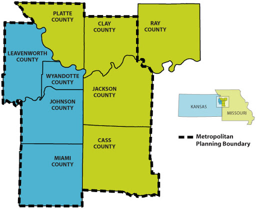
One is the KC region, which is home to about 2 million people

The other is Buchanan County approximately 87k people, which is home to MWSU
Note: I have this set up so that it regenerates these graphs every morning.
On to the Data
Note: Some of the data might be "kinky" and not smooth, the main reason for this is the insistence of politicians to try interfere with data gathering. A prime example of this is to look at Florida's data over the past year.
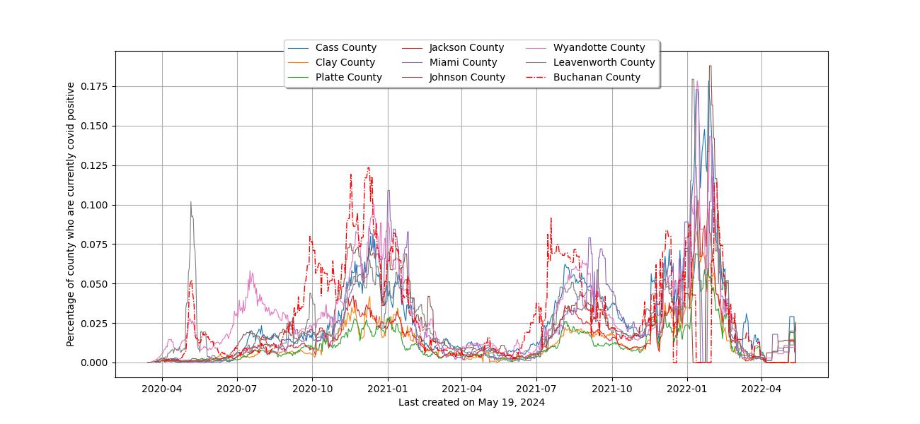
The first graph is percentile for each county of “New cases” with a rolling mean over 7 days. This is for all time since covid started. The reason for rolling mean is because most info that is collected is not perfect but over time a picture will evolve. For instance, if there is a bank holiday, you will get spikes in the data, rolling means flatten those spikes.

The next graph is just the same graph as above except for the past 180 days.

Lastly is recent information, just 45 days
